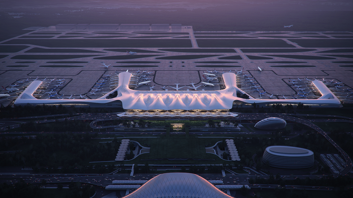
Spatial Systems
Nanning Wuxu International Airport Planning and Terminal 3
Shaping a gateway for southern China through regional narrative, integrated movement sequencing and cross-partner coordination.
Nanning Wuxu International Airport is an important gateway for communication between China and ASEAN. The Terminal 3 brief called for a transport complex integrating aviation, high-speed rail, subway and highway into one coherent passenger system, one of the more demanding multi-modal integration challenges in Chinese airport design.
As one of the project leads, my responsibilities covered external coordination with all partner organisations, internal team organisation and schedule management, planning and flow of the building layout, quality control of design deliverables, and the creative development of the project's narrative concept.
For HENEX, this case shows how a large transport complex can carry regional identity and still function as a clear, intuitive environment for passengers moving between modes under time pressure. The design ambition was not to make a dramatic object, but to make a terminal that reads immediately, moves people efficiently, and feels distinctly of its place.
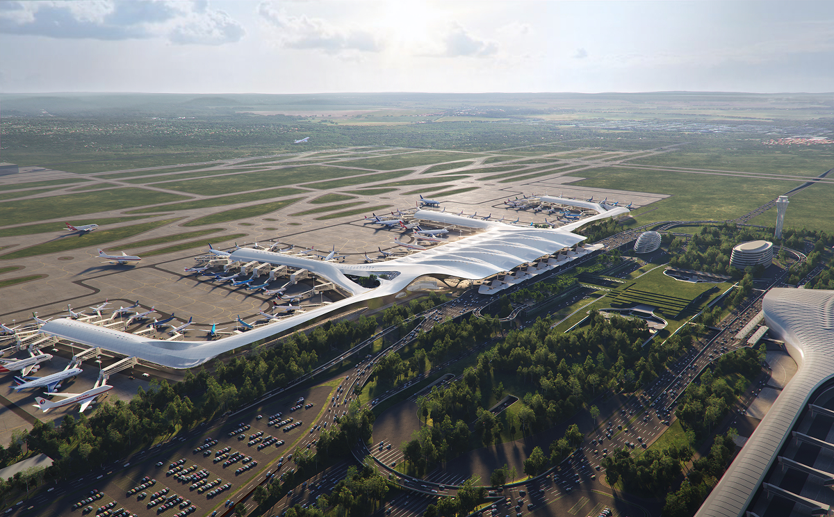 © GDAD
Within the project lead team, my focus was on two things that are easy to lose in large competition bids: the coherence of the design narrative, and the coordination of the many consultants and internal teams working in parallel. A competition at this scale involves structural engineers, transport planners, interior designers, visualisation teams and cost consultants, all producing material that has to read as one consistent proposal on submission day.
I was responsible for external coordination with all partner organisations, managing the schedule and deliverable quality across those groups. I also led the creative development of the narrative concept, shaping how the design story was told to the client, what cultural and functional ideas were foregrounded, and how the spatial sequence was communicated through visuals and text.
This role connects directly to later advisory and service design work. Holding a complex, multi-party project to a clear purpose, a readable story and a realistic timeline is the same discipline whether the context is a terminal or a public service improvement programme.
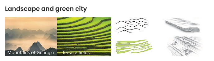
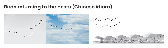
The design concept drew on four distinct strands of regional culture, each shaping a different aspect of the terminal's spatial and material language. Rather than applying a single regional motif across the whole building, the approach layered these references so the terminal would feel genuinely rooted in Guangxi without becoming illustrative or decorative.
Landscape and green city brought the mountains and terrace fields of Guangxi into the building's and green integration strategy. Birds returning to the nests, a well-known Chinese idiom, gave the roof form its fluid, dynamic silhouette. Gorgeous Zhuang brocade, a national intangible cultural heritage, provided the geometric logic for interior pattern, texture and screen systems. Splendid Yong City, the traditional name of Nanning and its hibiscus flower symbol, connected the terminal to its specific civic identity.
Together these four sources gave the design team a shared vocabulary for decision-making across the whole building, from roof geometry to interior material to landscape, without any single element needing to carry all the cultural weight alone.
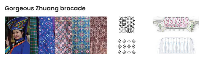
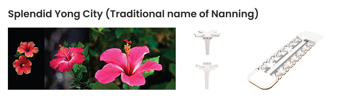
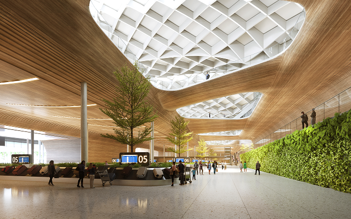
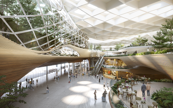
The interior strategy aimed to break the monotony of large transport spaces by using diverse local cultural themes to create a more rhythmic and experiential sequence. The integrated design approach, treating architecture, structure and interior decoration as one system rather than sequential layers, allowed the cultural references to be expressed through the building's structural and spatial logic rather than applied as finish.
The result was an interior that introduced landscape, living planting and natural light at key points in the passenger journey, so the experience of being in the terminal would feel genuinely close to the regional environment rather than generically international. For a gateway connecting China with Southeast Asia, that distinctiveness was both a design ambition and a practical differentiator in the competition.
 © GDAD
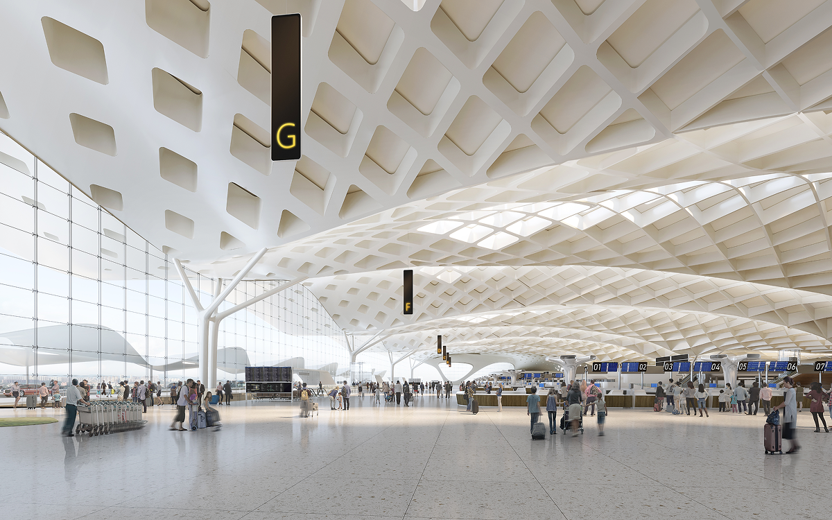
The departure hall had to reconcile two competing demands. It needed to be large enough to handle peak passenger volumes across a multi-modal terminal, and legible enough for passengers arriving from different transport modes, many of them unfamiliar with the terminal layout, to understand where to go immediately on entry.
The roof structure, derived from the birds-returning-to-the-nests concept, provided the spatial hierarchy that made the hall readable at scale. The structural rhythm created natural wayfinding zones, with lighter, more open areas marking key decision points and denser, more sheltered areas providing transition and waiting space. Material and light worked alongside structure rather than compensating for it.
 © GDAD
A competition terminal at this scale also had to work as a civic landmark. The terminal's external form, with its fluid roof line drawing from the birds and landscape references, was designed to be recognisable from approach views, from the highway, from the rail connection and from the air, without relying on a single dramatic gesture that might age poorly or conflict with the terminal's functional legibility.
The relationship between the terminal's form and the surrounding airport infrastructure, the taxiways, the satellite buildings, the interchange connections, was part of the design from the start. A terminal that reads as a landmark in isolation but feels disconnected from its transport context defeats the purpose of a multi-modal gateway brief.
 © GDAD
This project reinforced how much a competition bid depends on a clear, shared story. The four-strand cultural concept worked not just as a design direction but as a coordination tool. When teams across structure, interior, landscape and visualisation all understood what the design was trying to say, decisions at detail level became faster and more consistent. Narrative coherence is not just a presentation concern, it is a project management discipline.
It also showed me the limits of what a competition can test. A submission captures a design direction at one moment in time, under competitive pressure, without the feedback loops of actual delivery. The real test of how well the multi-modal sequencing, the wayfinding logic, and the cultural integration would hold up comes only in construction and use. That awareness of the gap between submission and reality has shaped how I approach evidence and testing in later service design work.
Although this project did not proceed to construction, it remains one of the clearest examples in my practice of using cultural narrative as a practical design tool rather than a decorative layer, and of coordinating a large, multi-party design process around a shared concept.
HENEX Method Recipe
R18 explains how a complex transfer terminal becomes readable step by step.
Primary recipeR18 · Step by Step Path Design
This case connects to R18 because a multi-modal terminal asks passengers to complete a sequence of decisions under time pressure, understand what mode they arrived on, decide which connection to take next, and act on that decision before the environment overwhelms them. The design strategy structured that sequence, making each step visible and supported by spatial, material and cultural cues rather than signage alone.
Secondary recipe
Related Projects
More work across service, digital and spatial systems.
 Spatial Systems
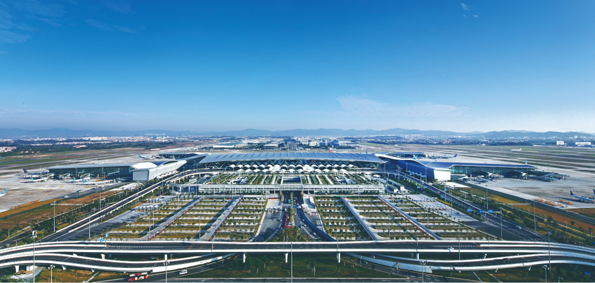
Guangzhou Baiyun International Airport Terminal 2 and Supporting Facilities
A transport architecture case for airport terminal delivery.
Spatial Systems
Guangzhou Baiyun International Airport Terminal 2 and Supporting Facilities
A transport architecture case for airport terminal delivery.
 Spatial Systems
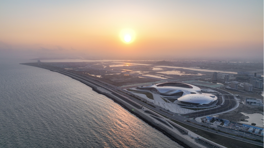
East Campus of Shantou University and Asian Youth Games Venue, Phase I
A campus and sports venue case for civic delivery.
Spatial Systems
East Campus of Shantou University and Asian Youth Games Venue, Phase I
A campus and sports venue case for civic delivery.
 Spatial Systems
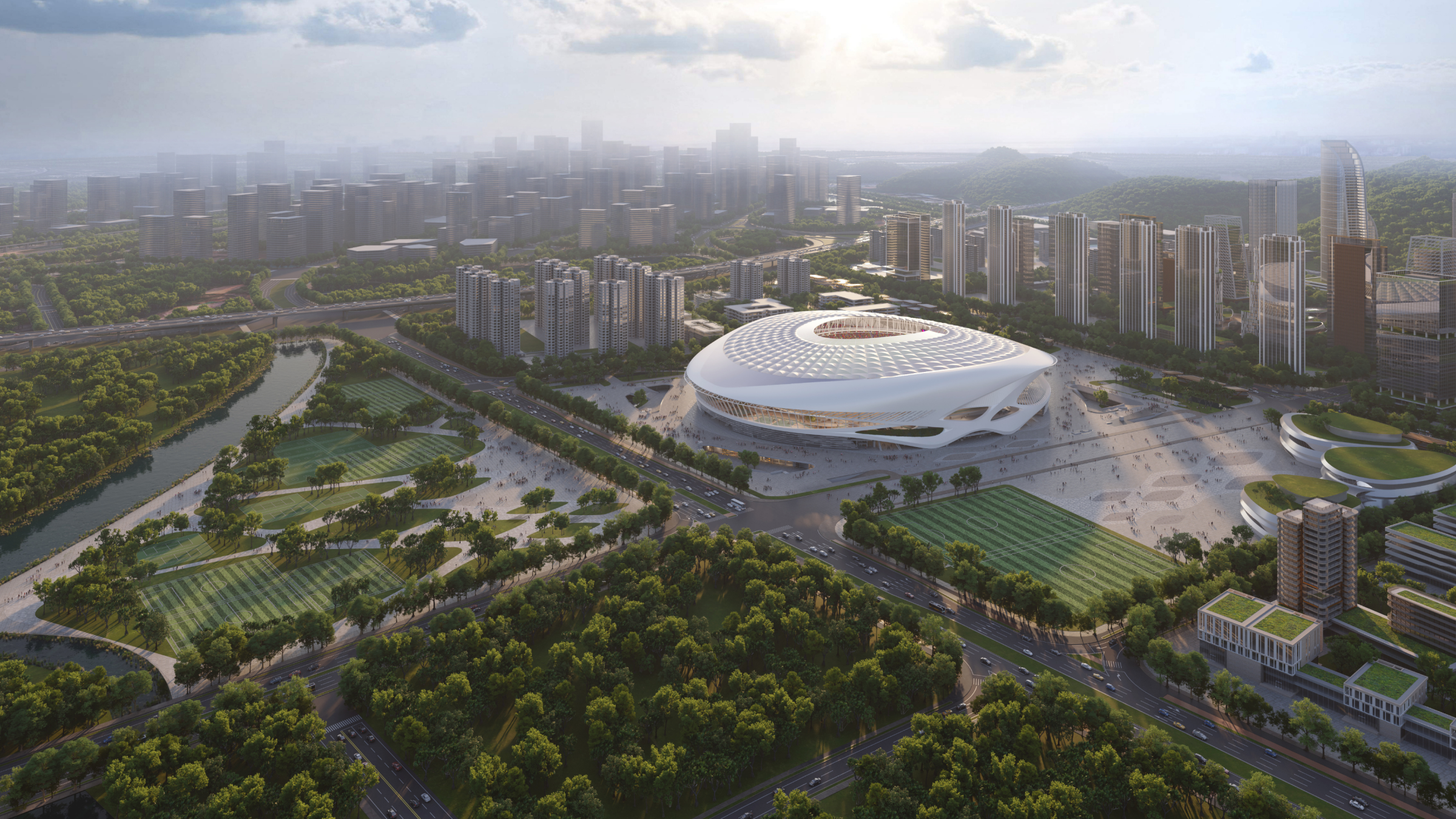
Guangzhou Football Park
A public sports venue case for large-scale delivery.
Spatial Systems
Guangzhou Football Park
A public sports venue case for large-scale delivery.
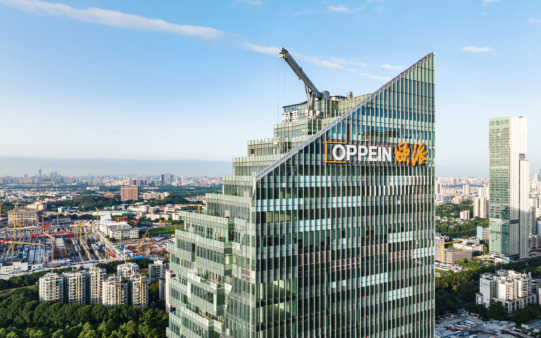 Spatial Systems
Oppein Headquarters Building
A headquarters project focused on identity and facade.
Spatial Systems
Oppein Headquarters Building
A headquarters project focused on identity and facade.