Spatial Systems
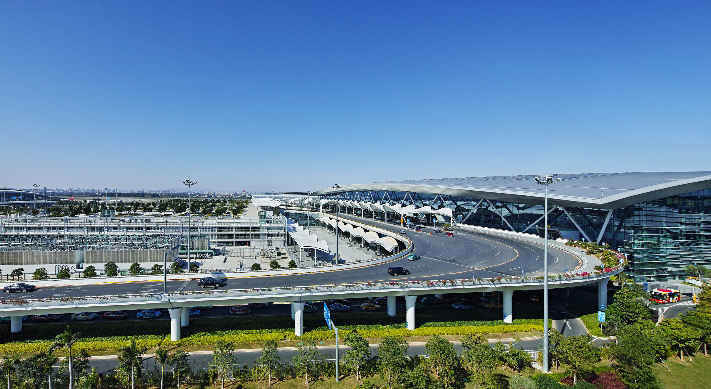
Guangzhou Baiyun International Airport Terminal 2 and Supporting Facilities
Shaping passenger interface, commercial flow and implementation quality in a major airport terminal.
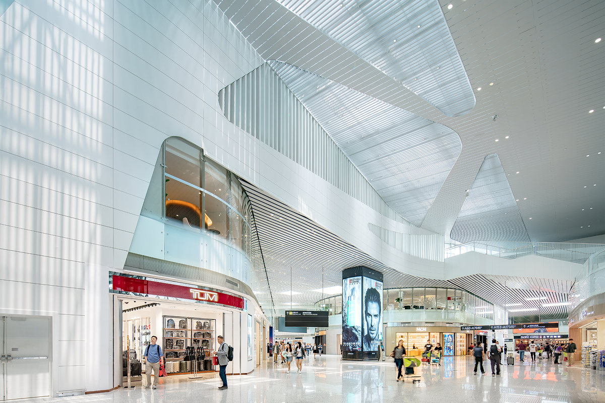
This case focuses on the passenger-facing systems inside a major airport terminal. The work included commercial areas, check-in islands, counters, security check partitions, railing systems and the detailed control needed to bring these elements into the built environment.
The project was not only about terminal form. It required decisions about how passengers see, understand, move, wait, check in, pass through security and use services. The design work had to balance spatial clarity, operational logic, material durability, human scale and construction quality.
For HENEX, this case shows how built environments can shape public experience through sensory wayfinding, service touchpoints and physical detail.
I served as Architect in Charge for the overall project and contributed as one of the scheme design contributors. My role included architectural control across the terminal design, with deeper implementation responsibility for all commercial areas during the construction documentation stage.
I also worked on passenger-facing facility systems, including check-in islands, counters, security check partitions and railing systems. These elements required coordination between passenger movement, operational requirements, human scale, material durability, visual quality, manufacturer samples and site implementation.
This role gave me a close view of how large public environments are experienced through both spatial systems and small physical touchpoints. Counters, partitions, patterns, materials and boundary systems became part of how passengers read the terminal and move through it.
Context
A national aviation hub.
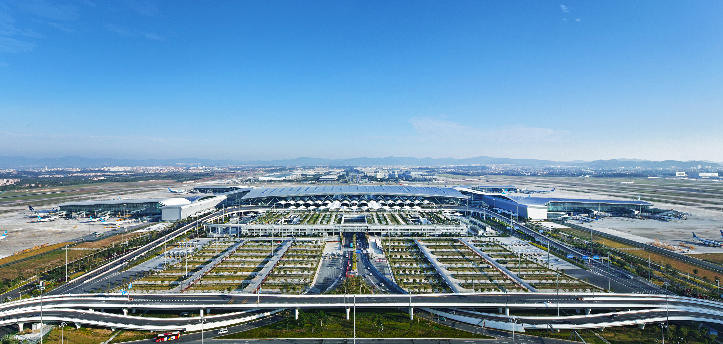
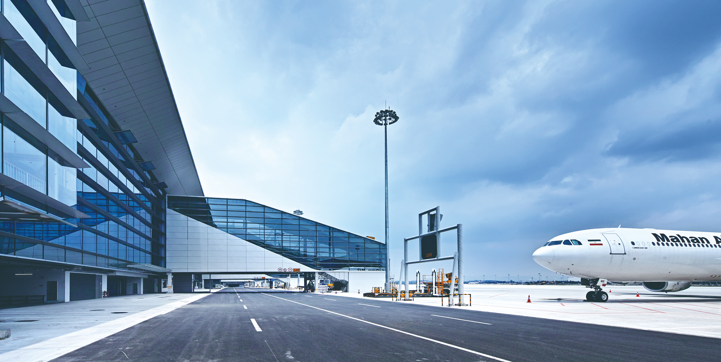
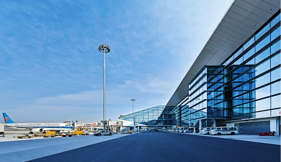
Terminal 2 forms part of a major airport system designed for high passenger volume and complex movement. The terminal brings together departure and arrival flows, commercial areas, security processes, service counters, airside connections and landside access.
In this context, architecture had to work at multiple scales. The terminal needed a clear overall identity, but it also needed spaces and details that passengers could understand during time-sensitive journeys. Movement, visibility, waiting, service access and operational flexibility all shaped the design problem.
Airport commercial areas do not work like conventional shopping centres. In a typical shopping centre, movement can be exploratory and repeated. In an airport terminal, passenger movement is directional, time-limited and shaped by check-in, security, immigration, boarding and operational procedures.
This creates a specific challenge. Commercial space must be visible and accessible, but it cannot interrupt the transport function. Service facilities must be easy to find and use, but they also need to meet security, operational and maintenance requirements.
Passenger attention is limited, so spatial cues, material boundaries and service touchpoints need to work together. The design challenge was to support movement while improving the visibility, usability and quality of the passenger-facing environment.
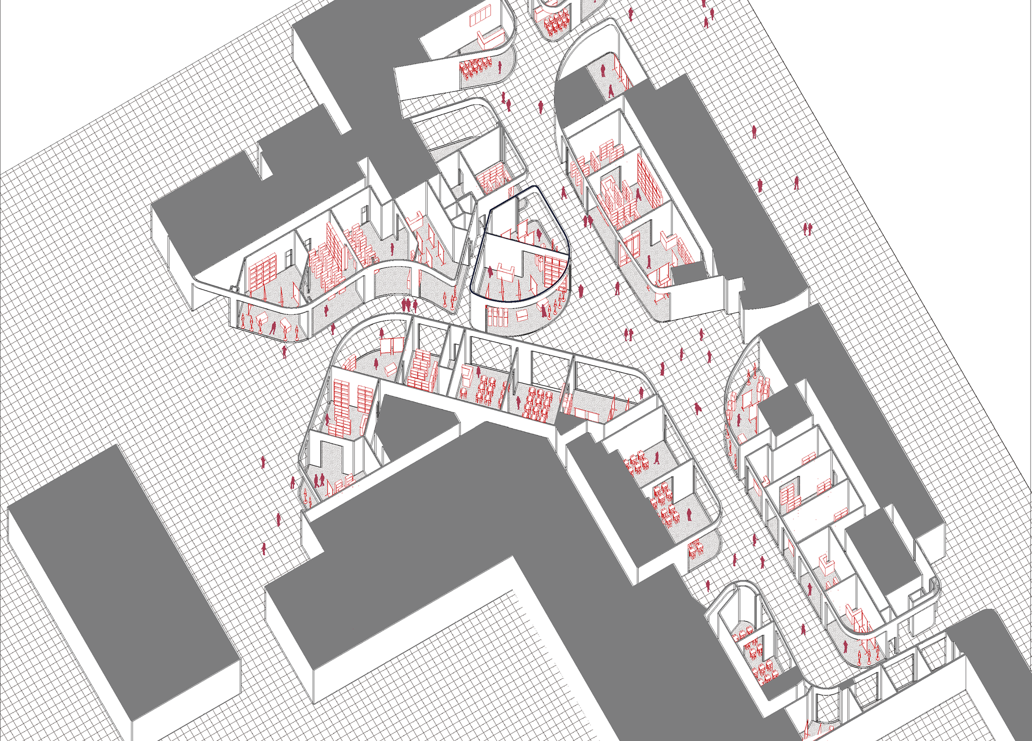
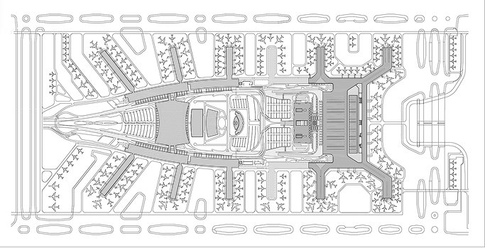
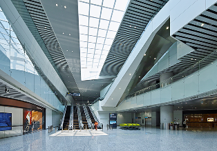
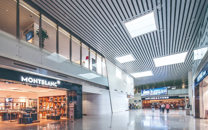
The commercial areas were planned around passenger movement rather than separated from it. The design approach treated retail visibility, circulation geometry and spatial recognition as part of the terminal experience. The commercial layout moved beyond a simple corridor arrangement.
Shops were distributed along key movement paths, entries were widened, and turning geometry was adjusted to improve visual continuity. The aim was to help passengers notice, understand and pass through the commercial environment without losing the clarity of the airport journey.
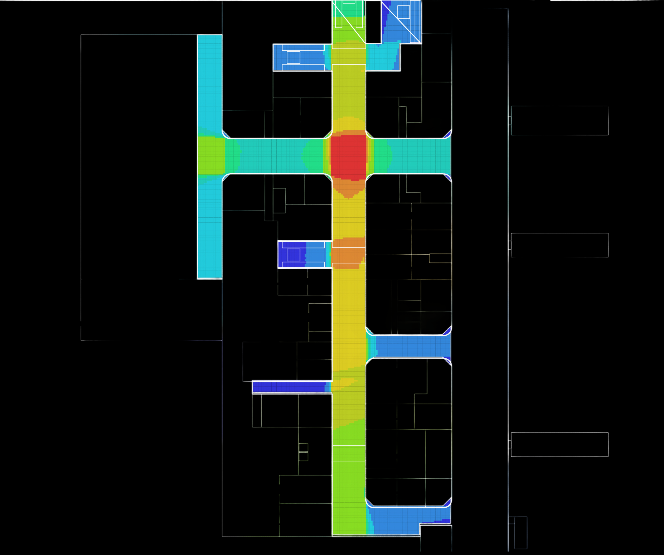
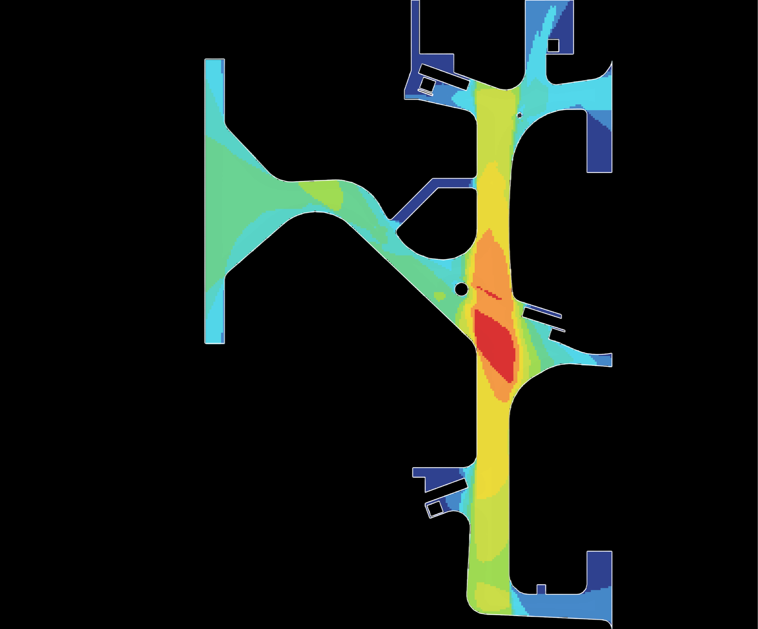
A later study used space syntax analysis to compare the commercial area before and after design optimisation. The study focused on visibility, accessibility and spatial cognition. It showed how circulation shape, shop distribution, entrance width and turning radius could affect how passengers see, reach and understand commercial space.
A Comparative Research on Commercial Area Design in Terminal Buildings of Hub Airports, A Case Study Based on Terminal 2 of Guangzhou Baiyun International Airport. South Architecture, 2022, 0(11), 60 to 67.
The optimised layout improved sightlines across the core commercial area.
Wider entries and adjusted circulation geometry increased reach and usability.
Commercial flow became easier to read without disrupting the wider airport journey.
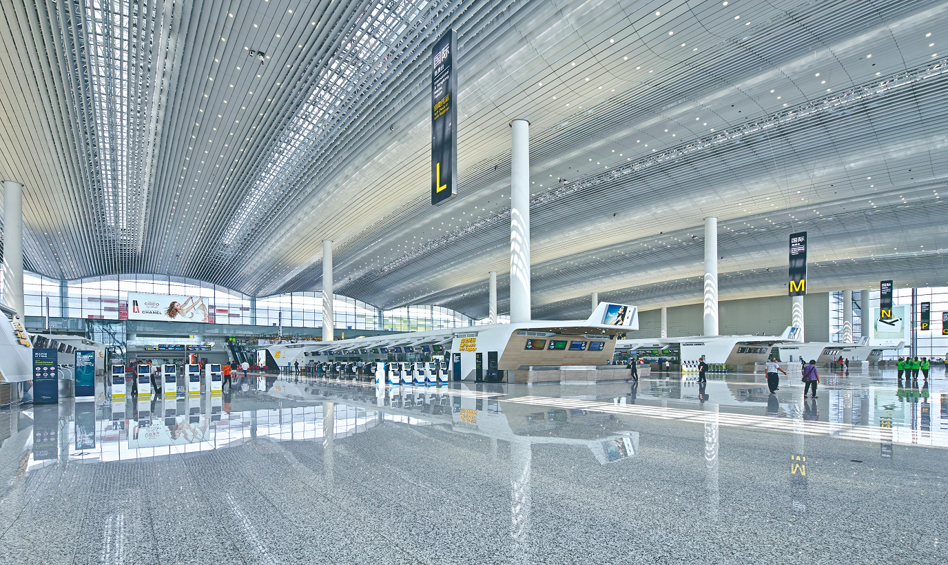
The passenger-facing facility systems were central to the terminal experience. Check-in islands, counters, security check channels and partition systems shaped how passengers approached services, understood boundaries, queued, interacted with staff and continued their journey.
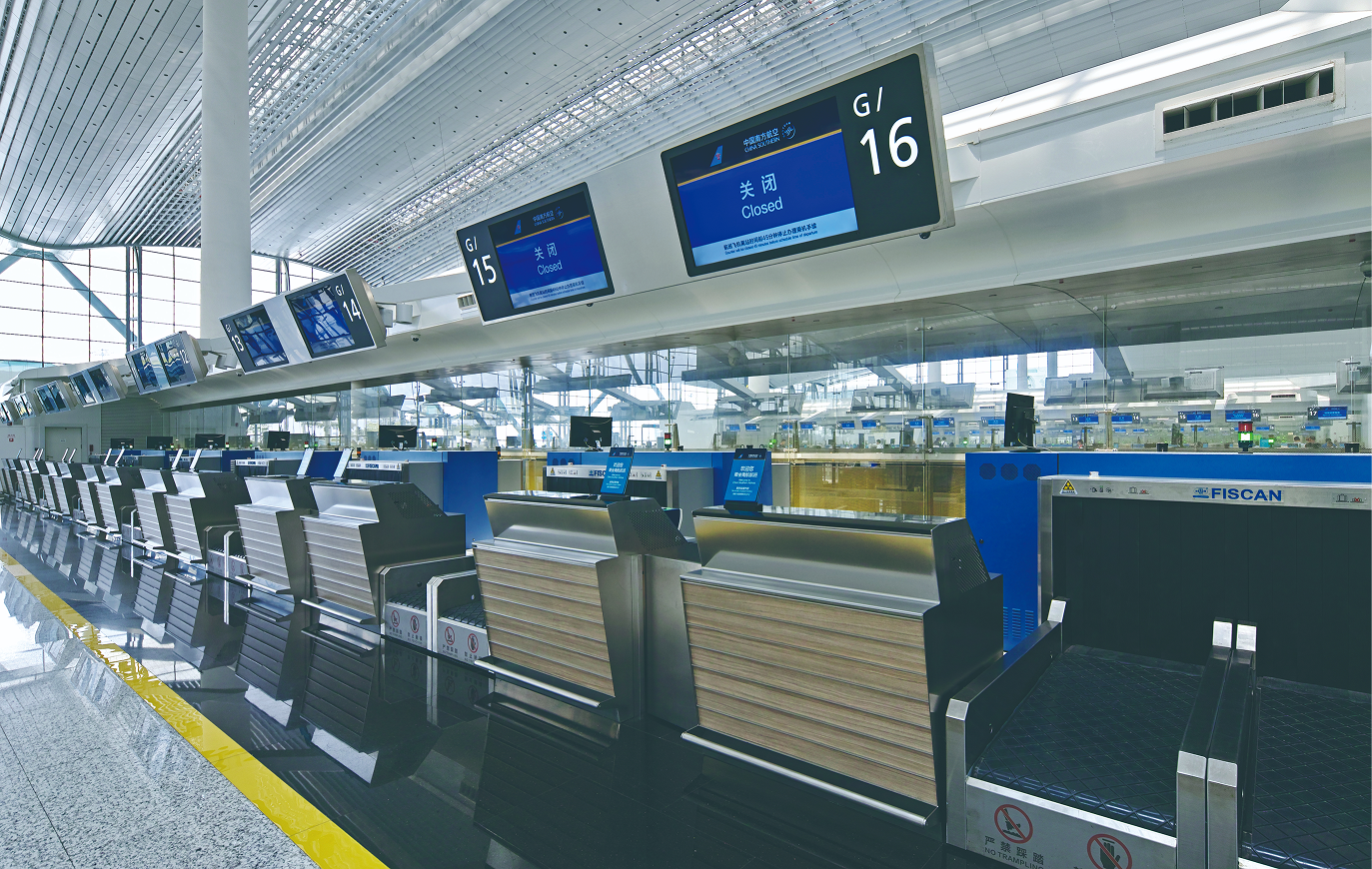
The counter system covered multiple functions, including check-in counters, security check counters, immigration inspection counters, service counters, inquiry counters and boarding counters. These counters needed to align with the interior language of Terminal 2 while meeting practical requirements for human scale, durability and ease of use.
Security check channels were designed as integrated facility units. A typical unit combined baggage inspection benches, verification counters, cameras, screens, service interfaces, reserved high-voltage and low-voltage connections, and finished partitions into one coordinated system.
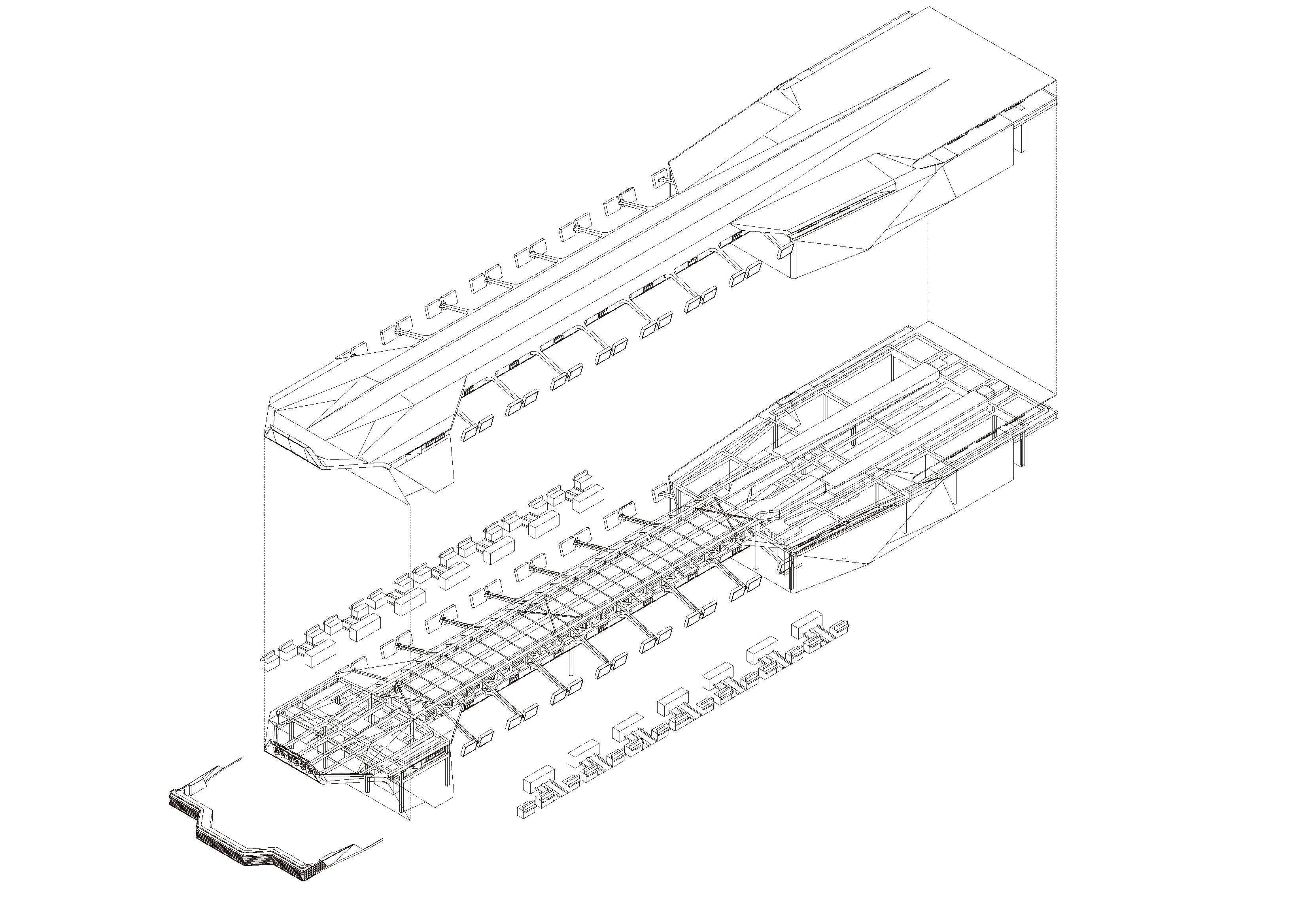
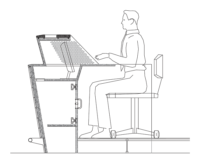
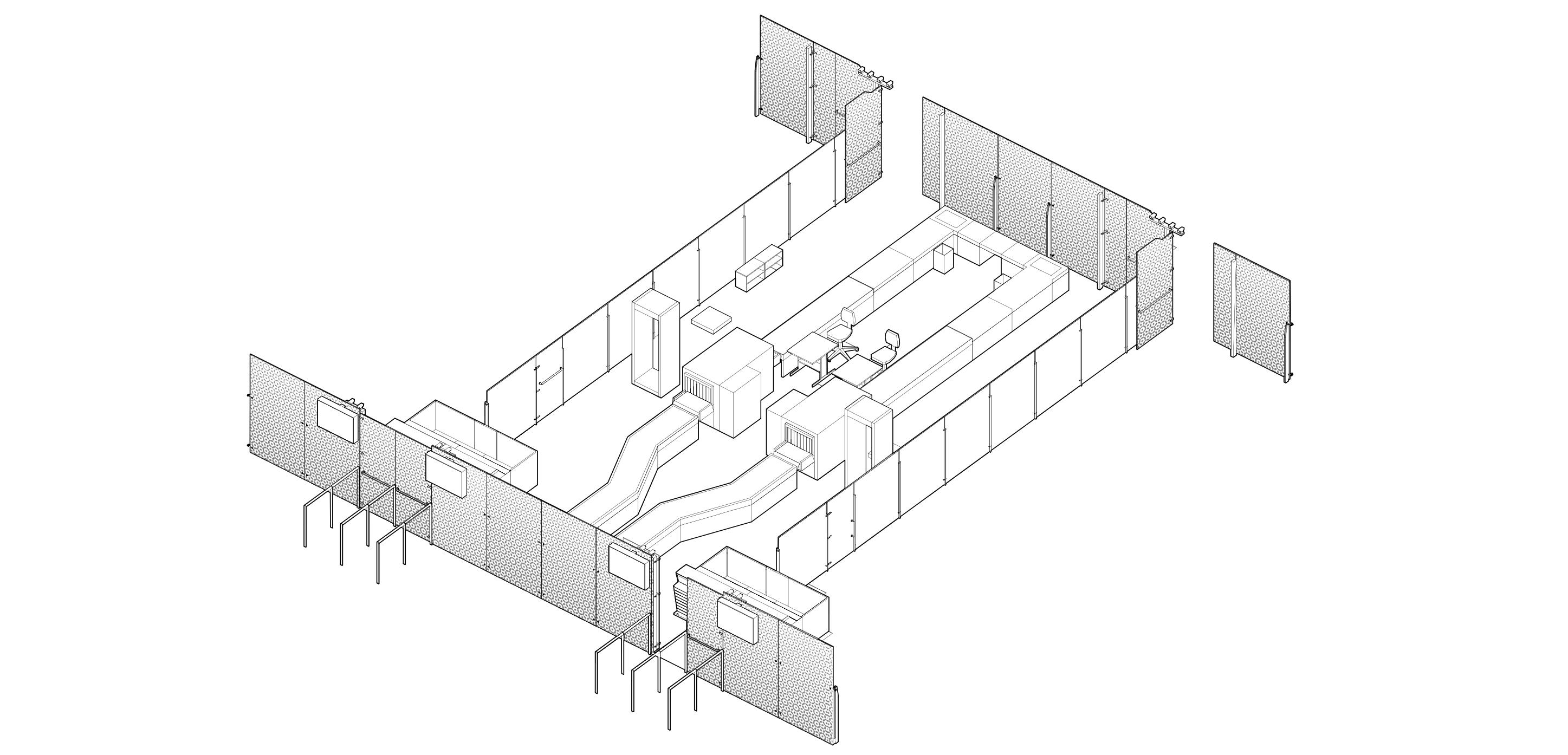
Implementation quality depended on how drawings, materials, samples and site decisions were controlled. For passenger-facing elements, the design could not stop at appearance. It had to account for ergonomics, material life, cleaning, technical interfaces, manufacturer constraints and consistency across repeated components.
Counters used brushed stainless steel panels in wood grain and natural finishes, with Chinese black granite and phenolic resin countertops. These materials were selected to balance visual quality, durability and alignment with the terminal interior.
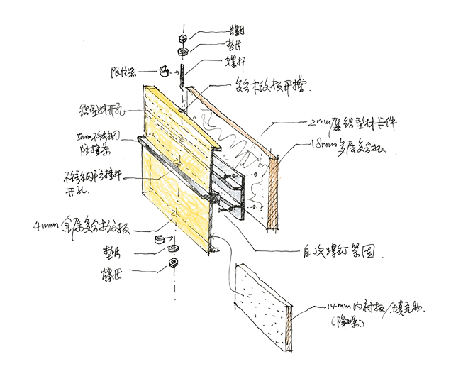
The fritted glass patterns in the partition systems required a separate layer of design and production control. I was responsible for the pattern design. During manufacturer coordination, sample production exposed technical and visual issues that needed to be reviewed on site.
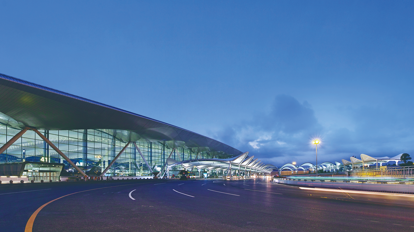
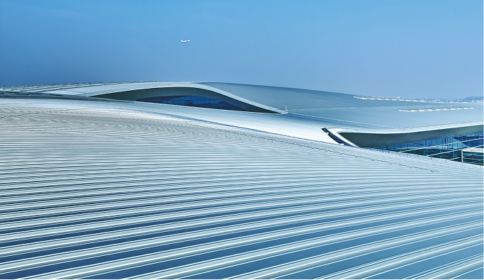
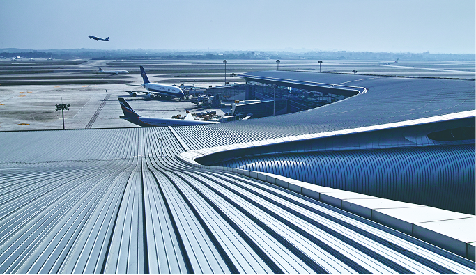
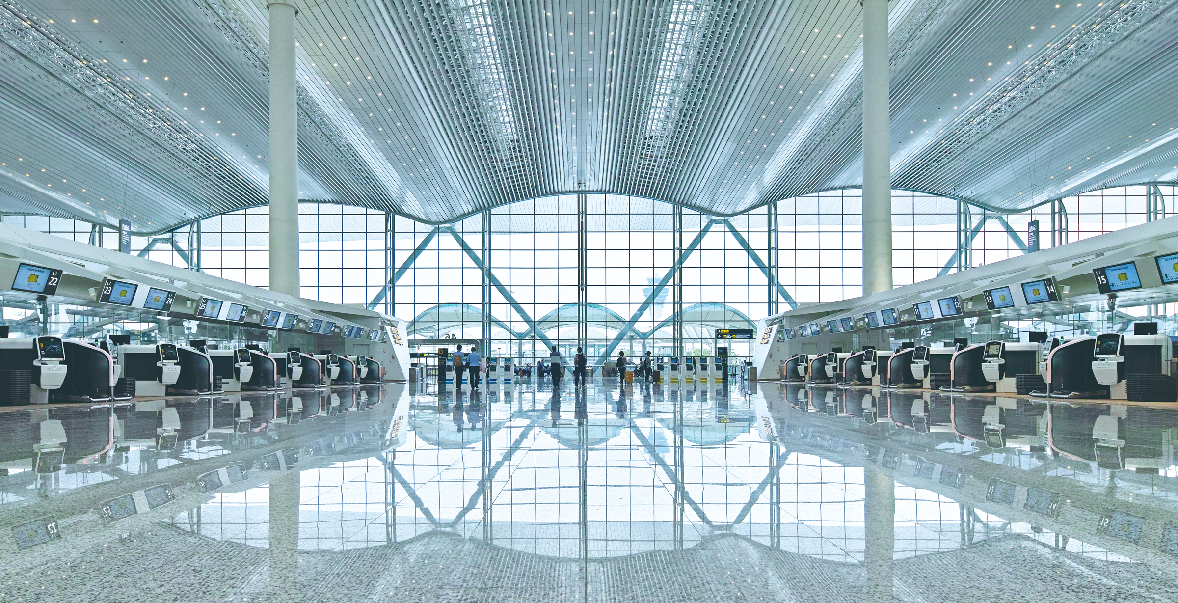
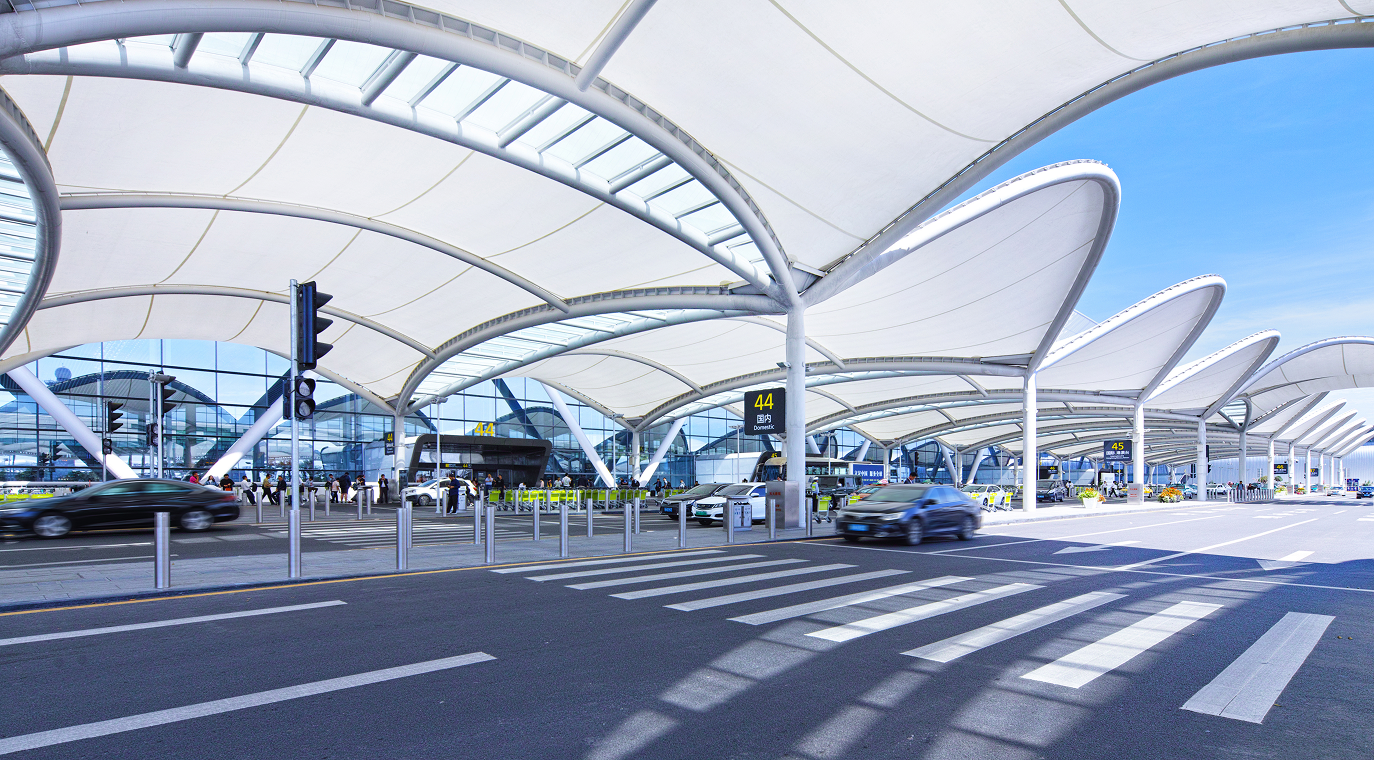
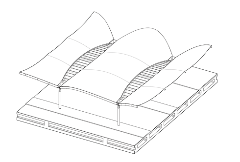
The terminal’s architectural language was shaped by the cloud concept, expressed through roof form, canopy rhythm, ceiling systems, light and material continuity. These elements supported the terminal identity while helping passengers read the scale and direction of the space.
The tensile membrane canopy became one of the first passenger touchpoints after arrival at the terminal frontage. The sequence continued through the departure hall ceiling and concluded again at the boarding bridge, where passengers moved from terminal interior to aircraft connection.
This section supports the HENEX lens through perception, affect and matter. The terminal is read not only through signs, but also through light, form, material, rhythm and spatial memory.
The project was completed and opened for public use as part of Guangzhou Baiyun International Airport’s expanded terminal system. It became a built example of large-scale transport architecture where passenger movement, commercial planning, service facilities and public-facing detail had to work together.
The project received national and provincial recognition for architectural design, engineering quality and green building innovation. The commercial area strategy was later examined through a published comparative study on hub airport terminal commercial design.
A Comparative Research on Commercial Area Design in Terminal Buildings of Hub Airports, A Case Study Based on Terminal 2 of Guangzhou Baiyun International Airport. South Architecture, 2022, 0(11), 60 to 67.
This project taught me that large public environments are understood through sequences of touchpoints rather than through one single architectural gesture. Canopy edges, check-in islands, queues, counters, partitions, commercial turns and boarding transitions all become part of how people read and remember a terminal.
It also made the connection between architecture and later HENEX work clearer. Public experience depends on visibility, touch, rhythm, material cues and service interfaces as much as it depends on form. This became an early bridge between built environment design and later work in UX, service design and public interface systems.
The project remains important because it shows how architectural design can move from scheme control to implementation quality while staying focused on passenger understanding, service use and spatial legibility.
HENEX Method Recipe
R11 explains how passenger movement becomes readable through spatial cues.
HENEX Lens
R11 · Sensory Wayfinding Map
Perception × Affect × Matter
This case connects to R11 because passenger movement depends on visibility, atmosphere and material cues rather than on signage alone. Commercial sightlines, public hall rhythm, counters, partitions, canopy edges and boarding transitions all helped make the terminal easier to read in motion.
Related Projects
More work across service, digital and spatial systems.
 Spatial Systems
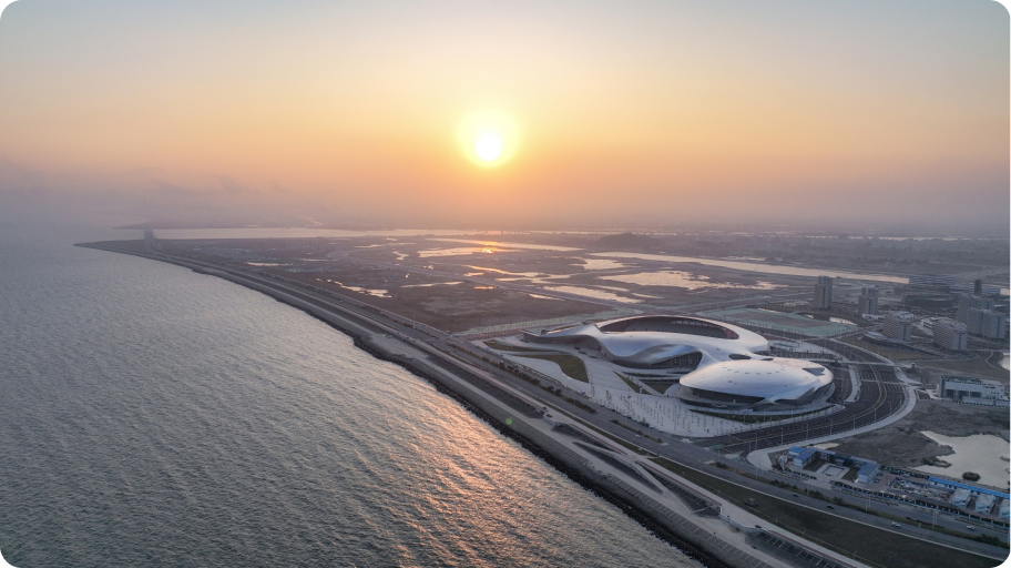
East Campus of Shantou University and Asian Youth Games Venue, Phase I
A civic sports and campus project shaped by rituals, venue experience and complex delivery.
Spatial Systems
East Campus of Shantou University and Asian Youth Games Venue, Phase I
A civic sports and campus project shaped by rituals, venue experience and complex delivery.
 Spatial Systems
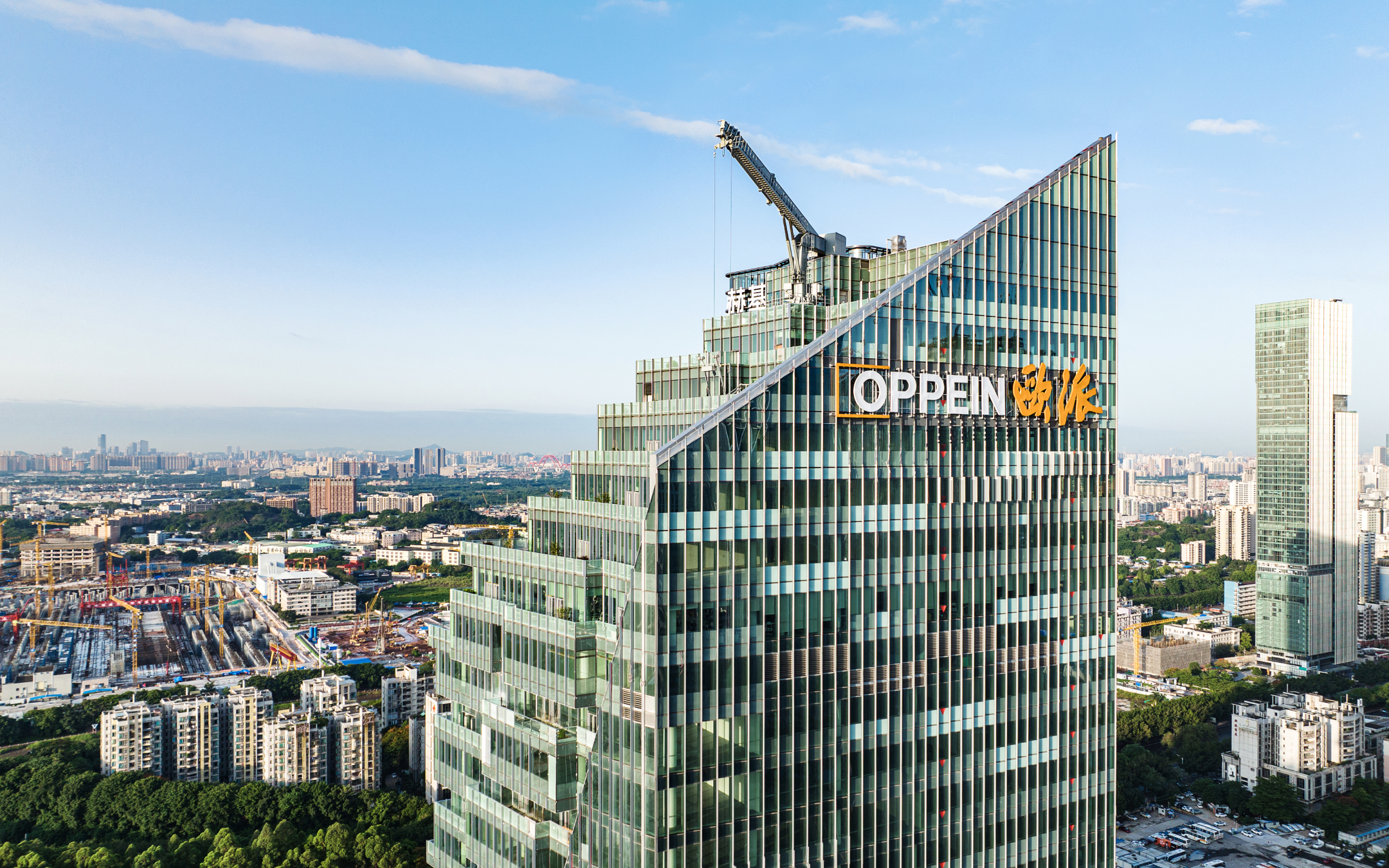
Oppein Headquarters Building
A headquarters project focused on identity, facade atmosphere, workplace experience and built effect control.
Spatial Systems
Oppein Headquarters Building
A headquarters project focused on identity, facade atmosphere, workplace experience and built effect control.
 Spatial Systems
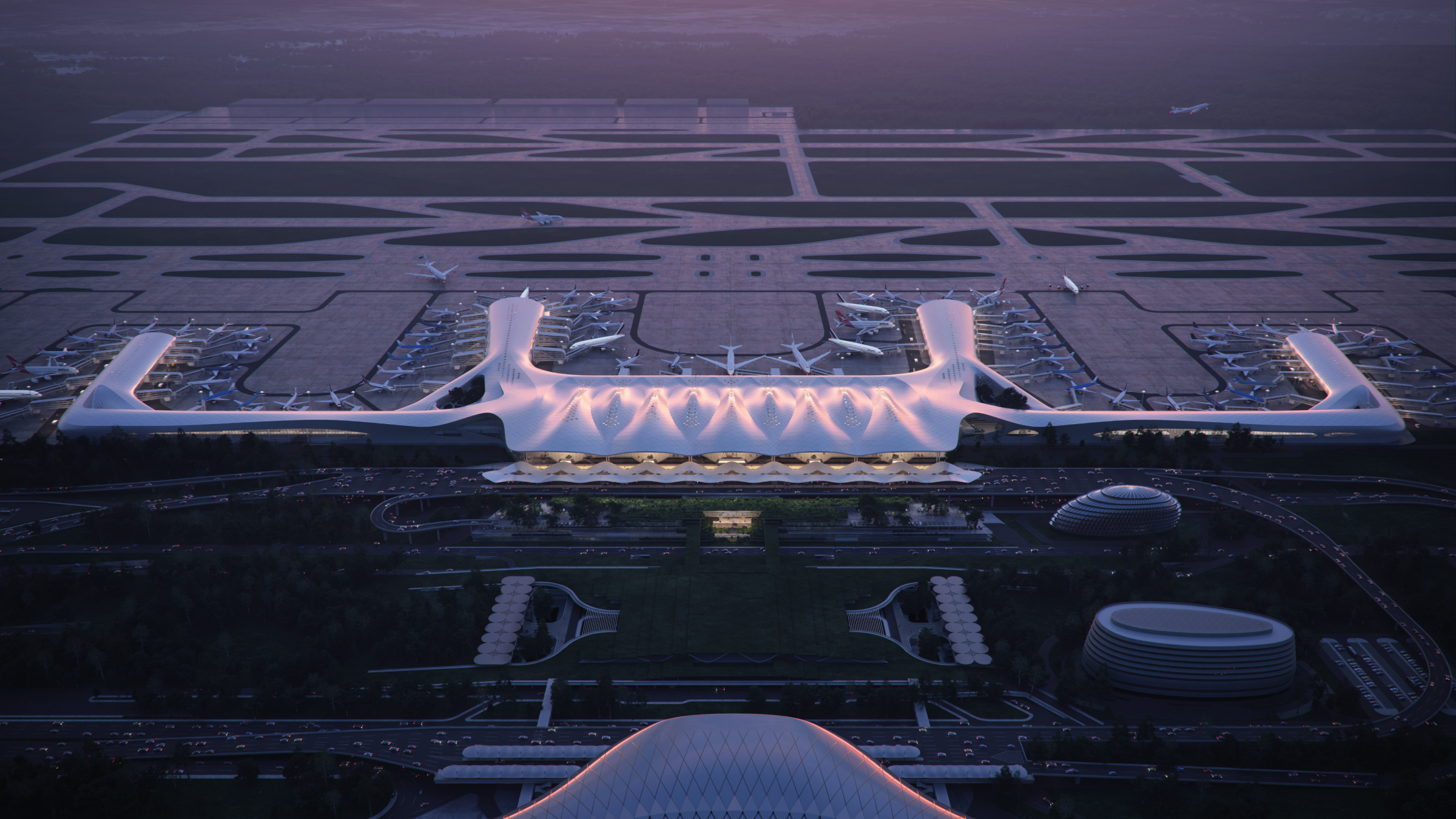
Nanning Wuxu International Airport Planning and Terminal 3
An airport planning case focused on movement sequencing, transport integration and terminal readability.
Spatial Systems
Nanning Wuxu International Airport Planning and Terminal 3
An airport planning case focused on movement sequencing, transport integration and terminal readability.
 Spatial Systems
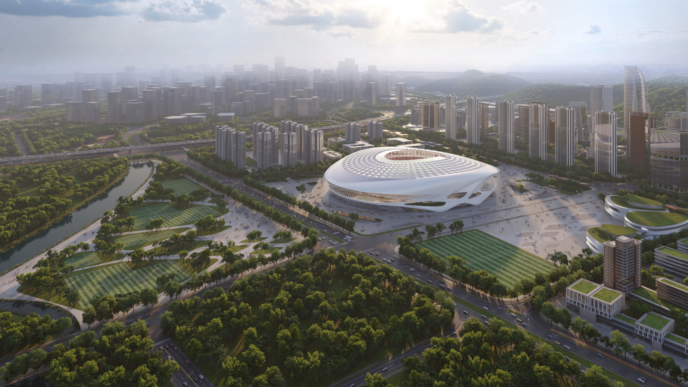
Guangzhou Football Park
A large public sports system shaped by narrative alignment, user environment and delivery control.
Spatial Systems
Guangzhou Football Park
A large public sports system shaped by narrative alignment, user environment and delivery control.