Listing terms assume local knowledge.
Words like "freehold" or "body corporate" were unfamiliar to most newcomers, who avoided listings rather than ask what the terms meant.
Welnest is a property search concept for newcomers settling into an unfamiliar city. Most listing platforms assume the user already understands local terms, trusts the agent network and can compare options confidently. New residents often have none of that context, so searching for a home becomes a source of stress rather than progress.
I treated the project as a trust-building problem before a search-interface problem. The work centred on plain-language listings, clearer comparison tools and a more transparent path to contacting an agent or booking an inspection.
Background
Newcomer families arriving in Wellington face a housing market shaped by unfamiliar policies, inconsistent listing quality, and processes that assume local knowledge. Existing rental platforms and guidance resources are fragmented across government sites, agent listings and word-of-mouth advice, leaving little support for someone navigating all of it for the first time.
Problem

Solution
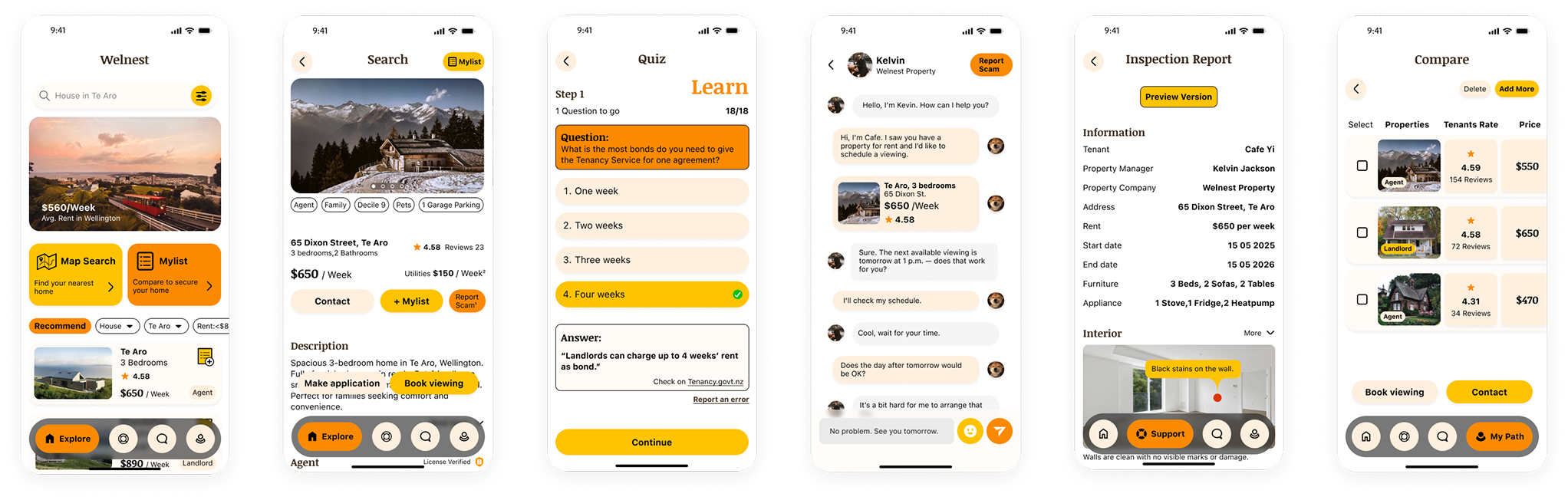
The solution rewrites listing terminology into plain language, adds a side-by-side comparison tool and makes contacting an agent or booking an inspection a visible, low-friction action rather than a hidden form.
Outcome
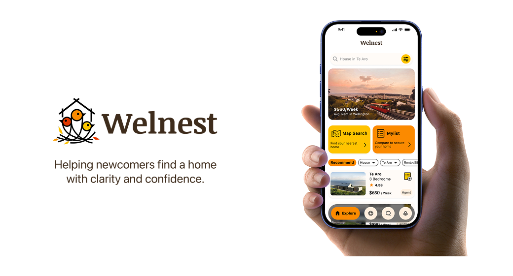
The final outcome is a covering search, comparison and inspection booking, refined through that surfaced six specific issues. I would describe this as a strong course deliverable rather than a validated product. The next evidence needs to come from real newcomer testing outside a classroom setting.
Feedback
Reviewers responded most to the clear explanation of the usability testing, the use of heuristics and accessibility, and the visual consistency of the final design.
“Great work describing how you used heuristics and accessibility in your final design, these slides were informative as you showed us examples.”
“Your user testing is well explained, and I thought it was great to hear about how you prioritised the feedback you got so that you used your time effectively.”
“Your final design has a good standard of UI design and visual consistency.”
Process
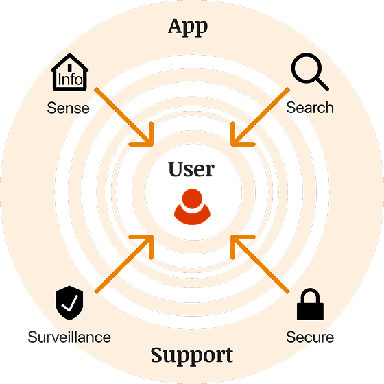
The project followed the framework, moving from open research on newcomer pain points to a tightly scoped, usability-tested prototype.
Research
Research combined interviews with recent newcomers and a review of existing property platforms. The goal was to separate confusion caused by unfamiliar terminology from confusion caused by genuinely unclear interface design.
The user journey traced four stages: an early, cautious search; a confusing middle phase of comparing unfamiliar listings; a more confident shortlist once terms became clear; and a final step of reaching out, which only felt safe once the listing already felt understood.
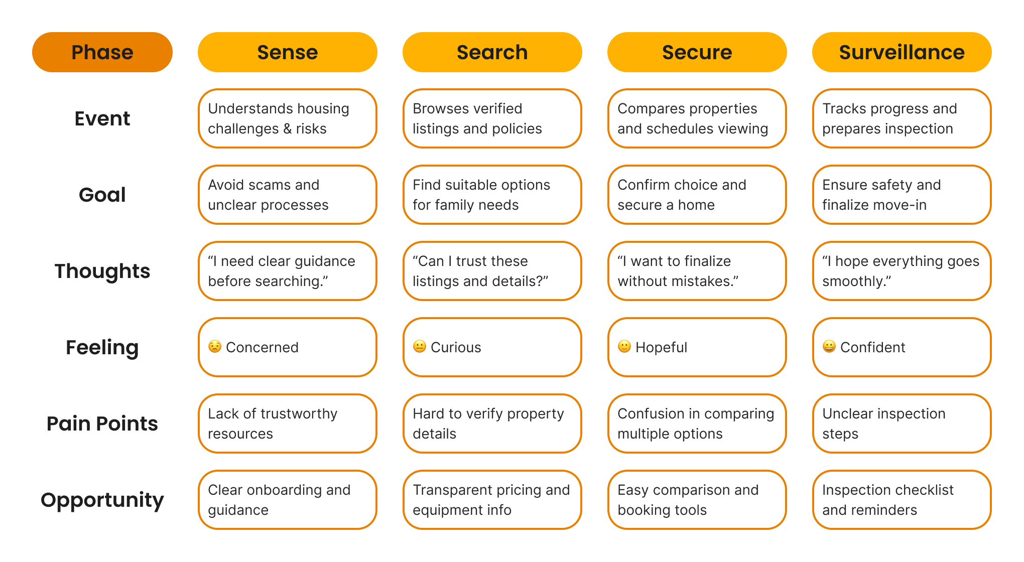
Three findings stood out as the most useful for shaping scope.
Words like "freehold" or "body corporate" were unfamiliar to most newcomers, who avoided listings rather than ask what the terms meant.
Without a built-in way to compare options side by side, people lost track of details across tabs and screenshots.
Unclear contact flows made users hesitate, worried about looking uninformed or committing too early.
The journey map showed that trust had to be built before the comparison or contact steps, not after. This moved plain-language listings from a nice-to-have to the starting point of the whole design.
Design
The findings were translated into six design principles. These worked as filters for deciding what to simplify, what to keep and what needed clearer explanation on screen.
Show what a listing means and where information comes from.
Replace jargon with language a first-time buyer or renter understands.
Reduce the steps and screenshots needed to compare listings.
Keep contrast, hierarchy and reading order usable for all newcomers.
Make the next step, like contacting an agent, feel safe to take.
Design for users with different language backgrounds and confidence levels.
These principles directly shaped the develop phase. Clarity and transparency drove the plain-language glossary, while supportiveness shaped how the contact and inspection actions were surfaced rather than buried in a form.
Develop
Development moved through ideation, , user flows and low-fidelity prototyping.



Design System
The design system covers typography, colour and brand foundations. This is a foundation built for a single course project, not a complete production-ready design system.
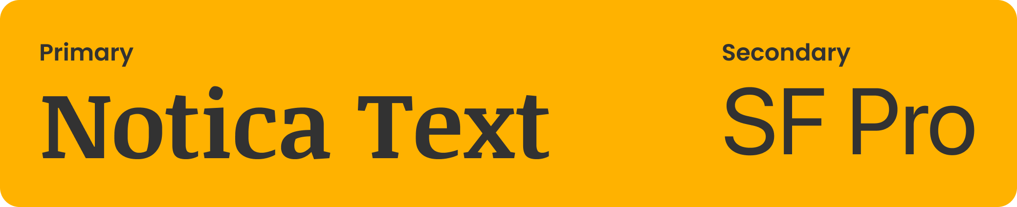
Noticia Text carries headings for warmth and personality, while SF Pro handles body text for fast, comfortable reading across listing detail.
The Welnest product palette uses warm yellow and orange tones with a soft cream background. These are the product's own brand colours, separate from the amber and gold used to present this case study on the HENEX site.
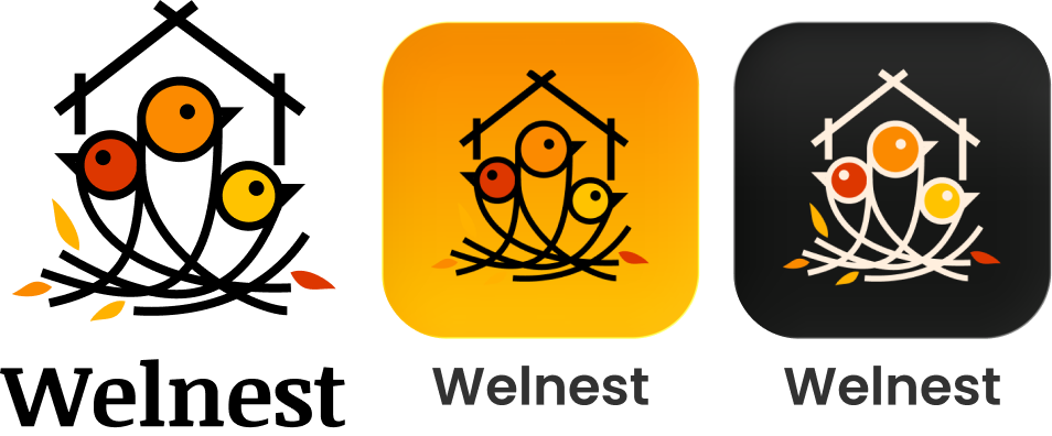
The logo combines a nest, birds and a house outline, representing newcomers building a sense of home and settling somewhere new.
Validation
Testing surfaced six specific usability issues, each of which was translated into a targeted interface change.
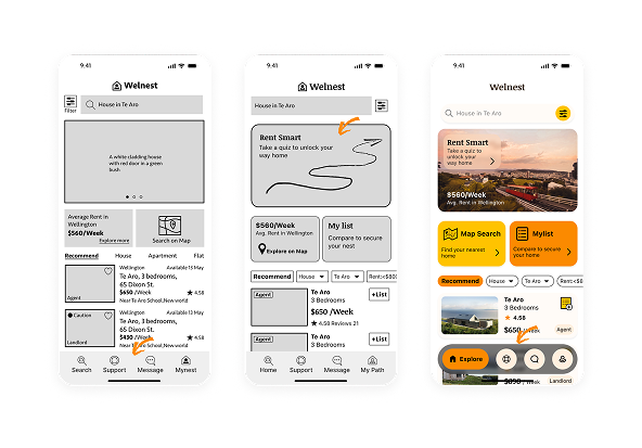
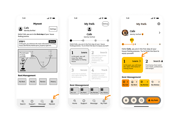
Users lost track of where they were in the search flow, so the interface needed clearer state and location cues.
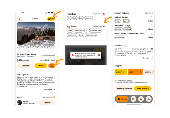
Property terms were still unclear to some testers, which led to inline plain-language explanations on key terms.
A listing quality score was misread as a guarantee rather than a guide, so the design added a short explanation of what the score covers.
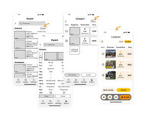
Testers wanted to compare more than two listings at once, so the comparison view was redesigned to support a short shortlist.
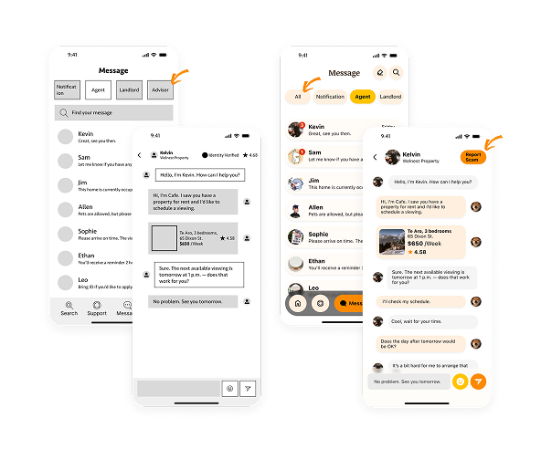
Some testers avoided the contact button, unsure what would happen next, so the flow now previews what the agent will see and how they will respond.
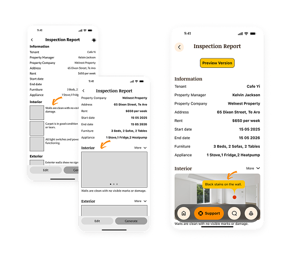
Testers expected to see inspection details before booking, which led to a short inspection summary added ahead of the booking step.
Usability testing gave the project a clear list of specific problems to fix, rather than a general polish pass. Each fix was scoped narrowly, which kept the prototype focused instead of trying to solve every possible issue at once.
Delivery
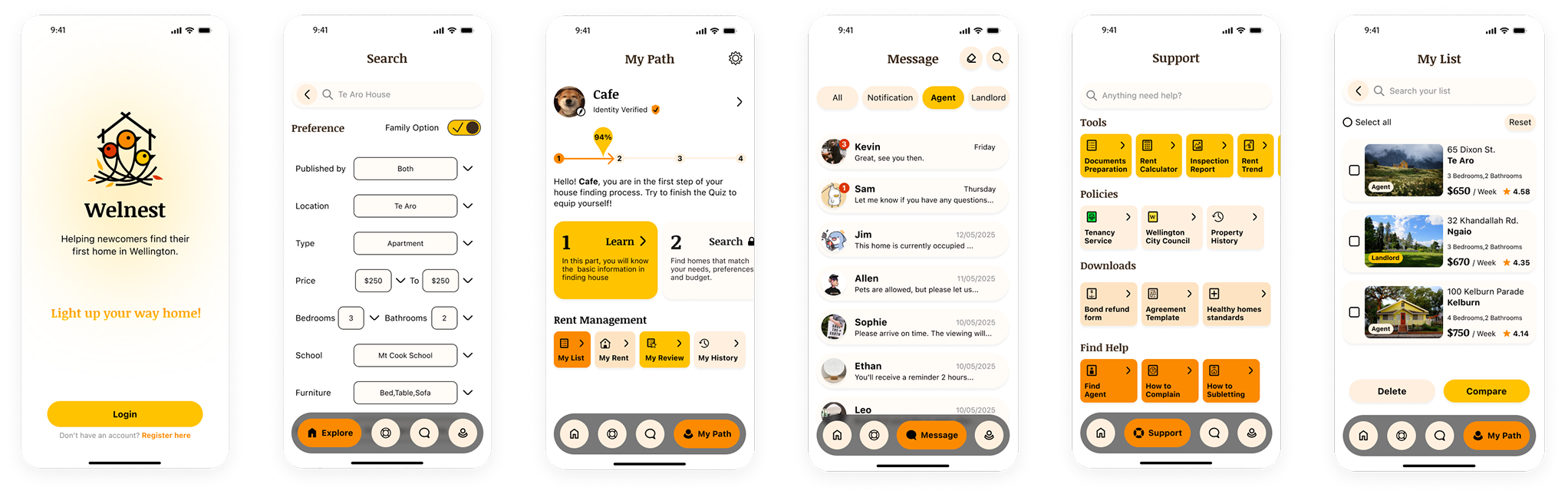
The final design carries the plain-language and supportiveness principles through two key moments: the listing comparison view and the agent contact step.
Comparison View
The comparison view lets users hold two or three listings in view at once, with terminology already translated into plain language so the comparison itself does not require extra research.
Contact and Inspection
The contact flow previews what happens after a message is sent and surfaces an inspection summary before booking, turning a hesitant click into an informed decision.
Reflection
Reframing the problem around trust, not just information, drove every later decision. The design principles kept scope focused, and usability-driven fixes made the final flow genuinely tested rather than assumed.
Personalisation depth is shallow, and the prototype has not been validated with real newcomers outside a classroom testing setting.
Next steps include defined usability metrics, diary studies with real newcomers, deeper personalisation and a dedicated accessibility review with analytics in place.
Primary recipe R06 · Inclusive Onboarding Paths
Newcomers arrive with different language backgrounds, confidence levels and local knowledge, so the entry experience has to adapt rather than assume. R06 connects these needs directly: plain-language listings reduce the barrier to understanding, the comparison tool supports confident decisions regardless of prior market knowledge, and the visible contact flow turns a hesitant click into a safe next step.
Secondary recipe
Related Projects
 Service Systems
Accessibility Support Hub
A support pathway case focused on clearer access to court assistance.
Service Systems
Accessibility Support Hub
A support pathway case focused on clearer access to court assistance.
 Digital Systems
Fevnote
A self-built fever log for parents, designed for one hand at night.
Digital Systems
Fevnote
A self-built fever log for parents, designed for one hand at night.
 Digital Systems
New World Design System
A design system case focused on reusable UI structure.
Digital Systems
New World Design System
A design system case focused on reusable UI structure.
 Digital Systems
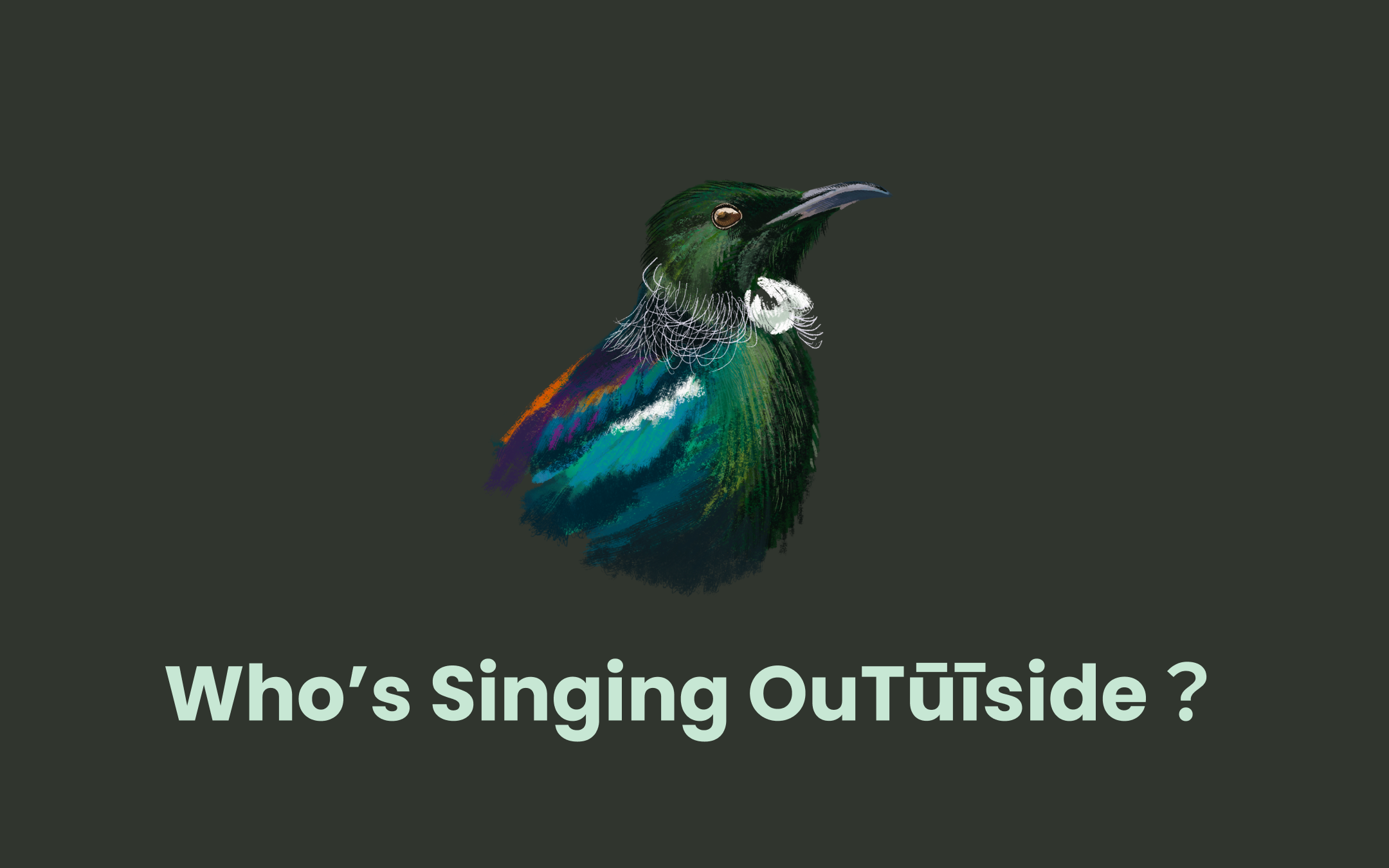
Who's Singing OuTūīside?
A public communication case using data, ecology and visual storytelling.
Digital Systems
Who's Singing OuTūīside?
A public communication case using data, ecology and visual storytelling.