Typing at night
Recording a reading takes too much typing for a parent holding a child with one hand.
A fever log for parents that records a reading in seconds, keeps every moment of care on one timestamp, and turns a sleepless night into one clear summary for the doctor.
Fevnote helps parents record temperature, medicine and how a child is doing during a fever, then review the whole illness as one timeline and one chart. It is built for night use and makes no medical judgement.
I designed and built it alone, from the first sketch to a live, invite-only release, working with Claude as an AI pair developer. The story here is mostly about the interface: what it takes to log a fever with one hand, in the dark, inside strict medical boundaries.
Background
When a child has a fever, parents keep track of readings and doses wherever they can: a notes app, a message thread, or just memory. At night this means typing in the dark, information split between two parents, doubt about when the last dose was given, and a hard conversation with the doctor the next day.
Problem
Recording a reading takes too much typing for a parent holding a child with one hand.
Readings, doses and notes end up in different places, or go unrecorded.
Parents lose track of when each medicine was last given, and by whom.
The course of the illness is difficult to describe clearly in a short appointment.
Solution
Three decisions shape every screen in Fevnote.
Temperature, medicine, condition and a note are saved together under a single time, so a dose and the reading around it always stay linked.
Scroll wheels set the temperature and the dose. The keyboard only opens for an optional note.
The app shows what was recorded and how long ago. It never says whether to give medicine or whether a reading is dangerous.
Outcome
Fevnote is live as an installable web app, currently at version 0.9 and in invite-only testing. All screens on this page use sample data for a fictional child.
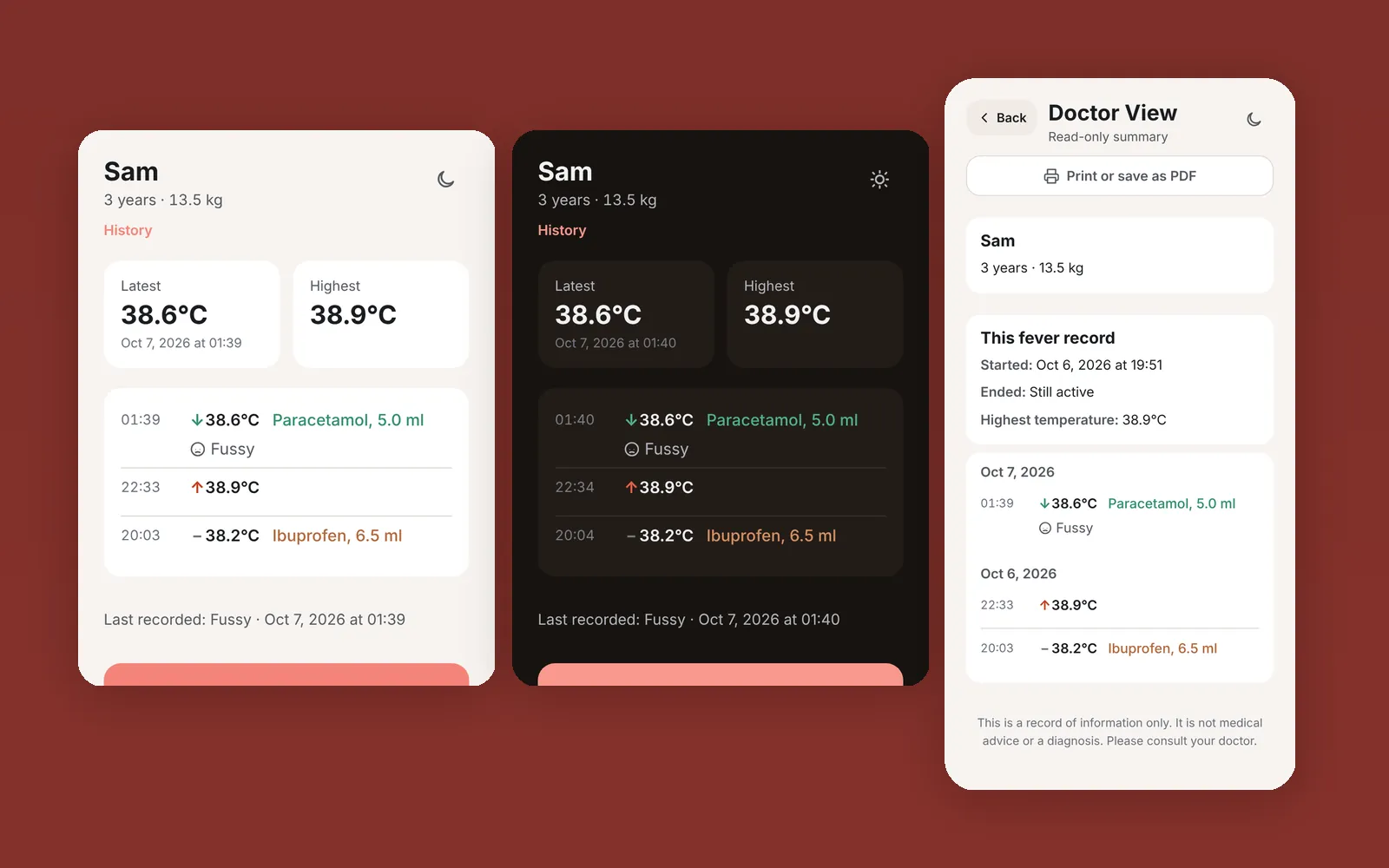
In Use
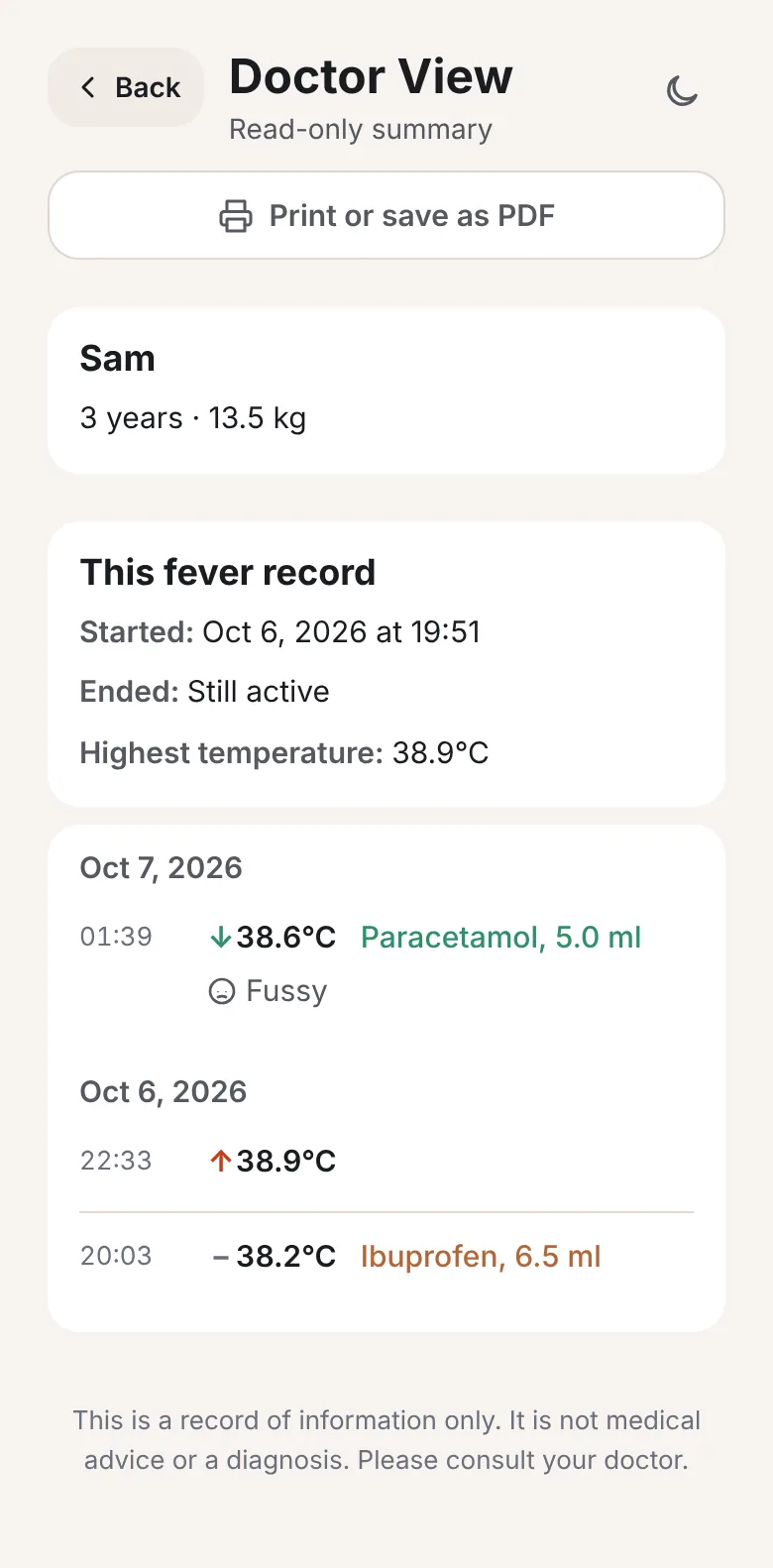
I used Fevnote through my own child's fever. At the GP visit I opened Doctor View, and the doctor could follow the whole course of the illness from that one summary. That was the scenario the product was designed for, and it was the success measure I set in the specification.
It is one family's experience, not a study. The screen on the right uses sample data.
Process
Constraints were set before any screen was drawn, and every build was tried on a real phone within hours.
Research
I did not run interviews. The research was problem framing: writing down the conditions the app had to survive, the lines it must never cross, and what could wait.
Night use, one free hand, two parents on two phones, and a doctor at the end of the illness who needs a clear account.
No dose advice and no labels such as safe or dangerous. Elapsed time is shown as a plain fact, with no colour or threshold attached to it.
Scope was cut before the build began.
Writing the constraints first meant the first build was small enough to try on a phone the same day.
Design
Each one came from using the app on a real phone, not from the specification alone. There was no Figma stage. The interface was designed directly in code and judged on device.
Decision 1
The first version had separate actions for temperature, medicine and note, each stamped with its own time. In real use a parent measures, fetches medicine, gives it and writes a note over several minutes. One moment of care became three timestamps, and the record could not answer the key question: what was the temperature when the medicine was given.
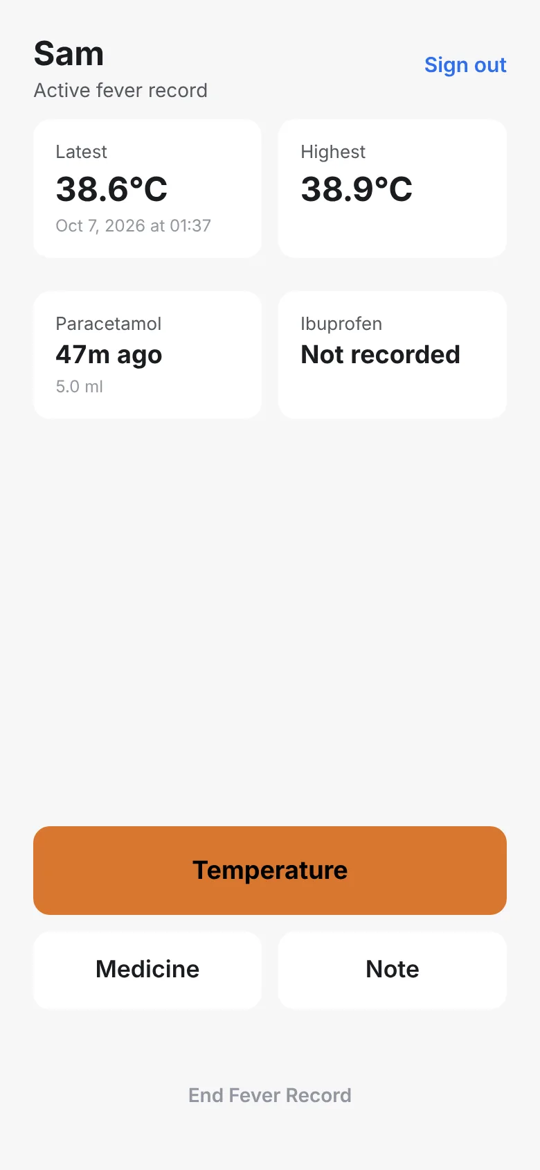
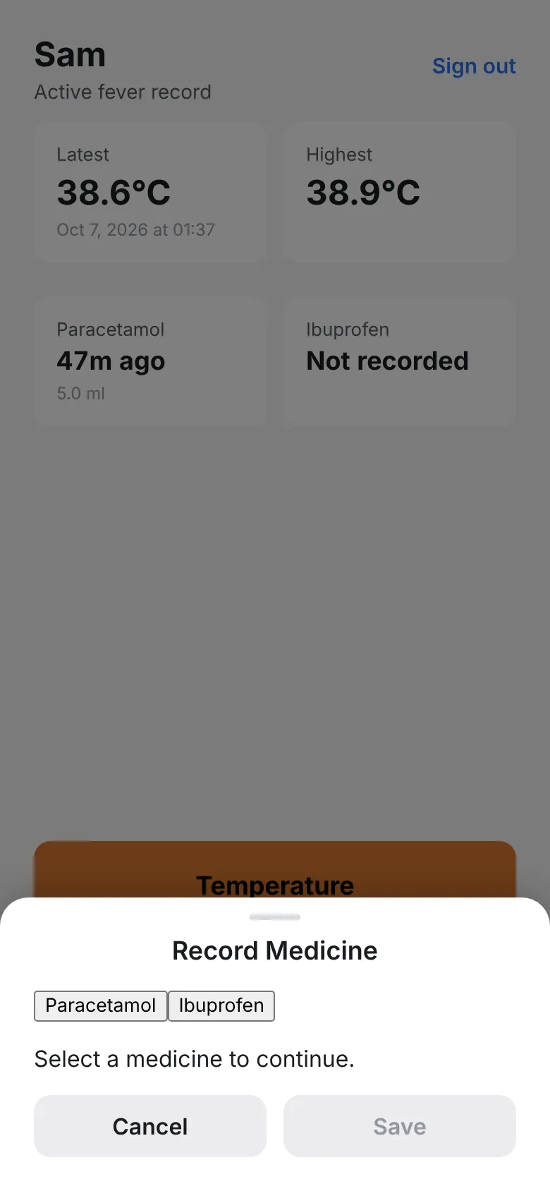
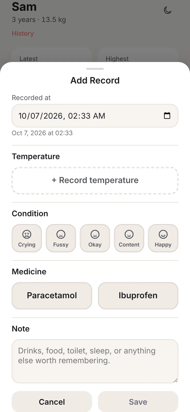
A first fix used collapsible sections, which I rejected because every reveal step costs time at night. The form was flattened so time, temperature and medicine are usable straight away. Temperature then became required, because a reading is always taken.
Decision 2
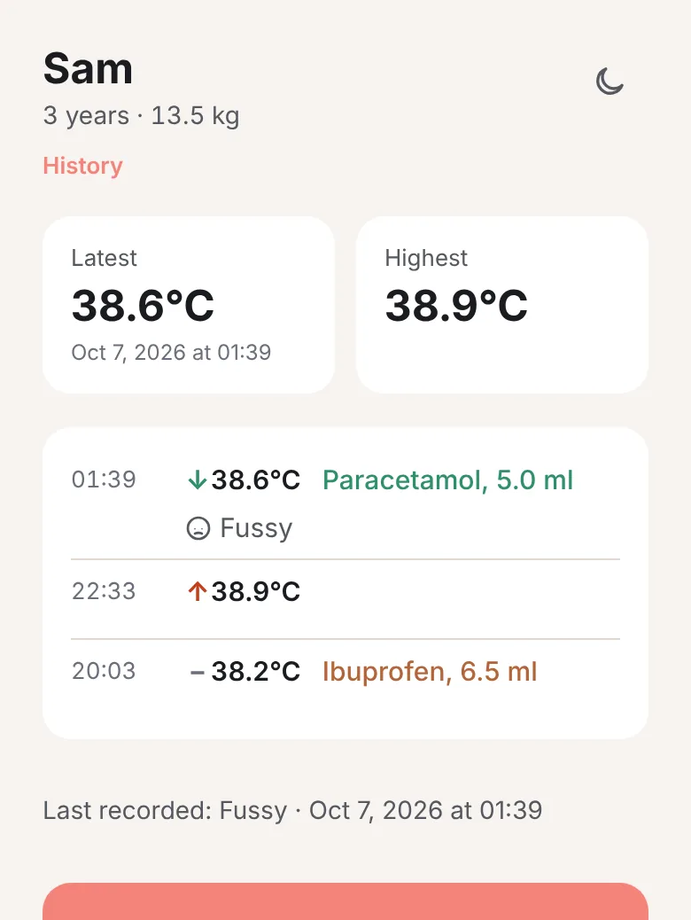
The recent readings list went through three shapes. It began as temperature only, then showed medicine as separate rows, and finally became one row per moment with time, temperature and medicine together. The separate-row version was rejected because it hid the link between a dose and the reading that followed.
Recent readings and the full timeline were then merged into one component with a Show more toggle, so there is a single list to learn.
Decision 3
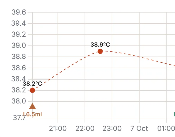
A shaded band marks the typical range of 36.1 to 37.2°C, taken from Mayo Clinic and checked against the original page. It uses a neutral tint, not traffic-light colours, so the chart shows where a reading sits without telling a parent how to feel about it.
The vertical axis keeps a minimum span, so a small change is never drawn as a dramatic curve. Only the highest, lowest and latest readings are labelled, after labelling every point made the chart feel cluttered.
Decision 4
Temperature and dose use scroll wheels built on native scroll snapping, so a thumb flick lands on a value. Testing on a real phone showed the wheel was capturing the page scroll, which made the whole screen feel stuck. The touch area was narrowed to the centre column, which left the sides free for normal scrolling.
Decision 5
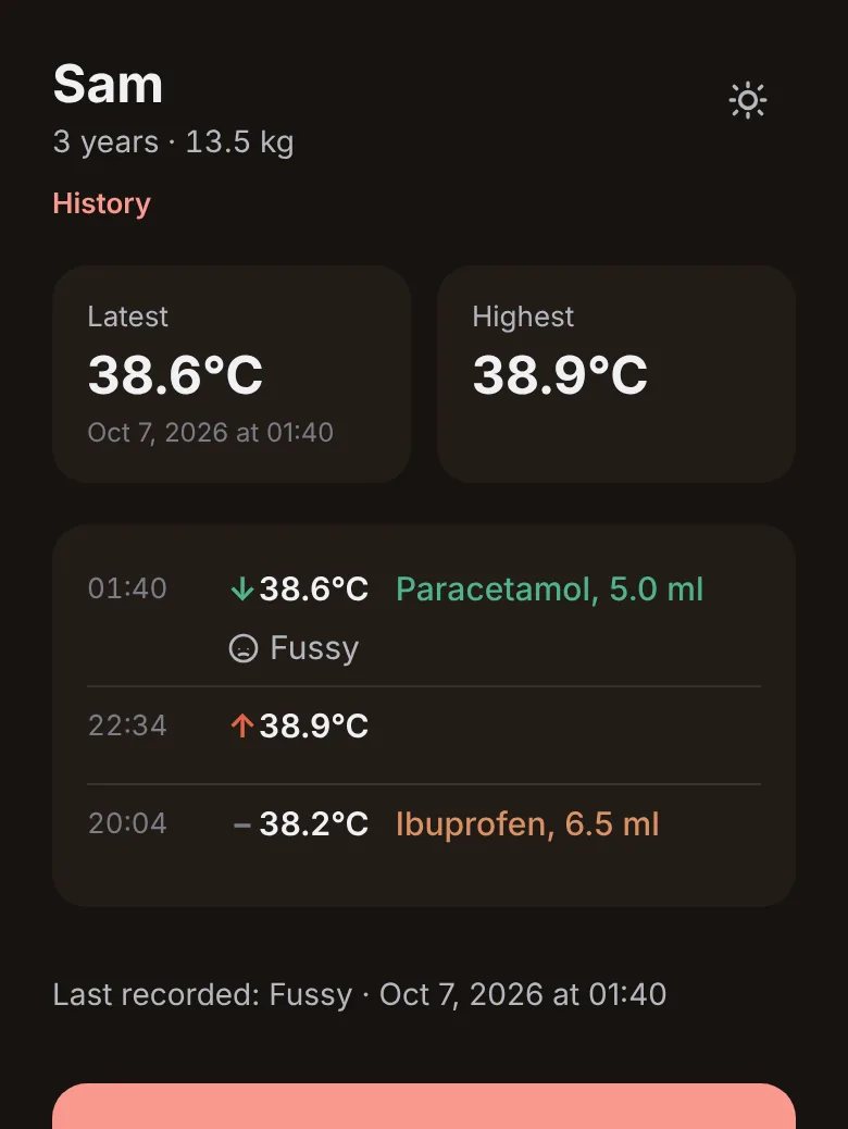
The coral palette comes from the app icon and follows the brief: warm, soft, comfortable, relaxed. An early orange button passed the contrast ratio on paper but read poorly, because the text and the background shared one hue. It moved to black text on coral.
Header controls were regrouped after mis-taps. A five-tier rule now decides whether a control is a button or a text link.
Validation
There was no formal usability study. Validation came from four kinds of live verification.
Each build was tried on a phone within hours. The findings drove the redesigns above: the unified record, the list shape, header mis-taps, wheel scroll capture and contrast.
I used Fevnote through my own child's illness, at night, with one hand.
The GP followed the illness from Doctor View, which is the scenario the whole product was designed for.
Database access rules were tested inside the database. The owner sees their own rows and anonymous visitors see none. A first check was found to prove nothing, so it was redone.
No formal usability study has been run yet. Testing with other parents is the next step.
Delivery
The same app serves a parent at night and a doctor in the morning.
Doctor View
Doctor View is a read-only page with the child's details, a summary of the record, the chart and the full timeline. It prints or saves as a PDF through the browser, with a plain note that it is a record of information and not medical advice.
Product features
Registration uses invite codes. One account can hold several children. The privacy policy is recorded with consent at sign-up, data can be exported, and an account can be deleted. A read-only admin panel exists, and it cannot see any child's name or recorded values.
Installable app
Fevnote installs from the browser on iPhone and Android and has light and dark themes. A short onboarding guide, built from the real screens, explains how it works before sign-up. Every decision and every change to the specification is written in a build log with its reason, which doubles as the handover document.
Registration is invite-only. You can still open the login page and read the "How Fevnote works" guide.
Reflection
A small product, scoped hard, that did its job in a real illness and at a real GP visit.
Testing in real conditions changed the core interaction within hours, which no amount of specification writing had predicted. A colour pair can also pass a contrast ratio and still be hard to read when both colours share one hue, so I now check contrast by eye as well as by number.
Testing with other parents beyond my own family, a re-consent flow for when the privacy policy changes, offline saving, and photo-to-record scanning, which was deferred.
Primary recipe R12 · Calm Clarity Tuning
A parent logging a fever is worried and short of sleep, so the interface has to lower the load rather than add to it. R12 covers the three places this shows: the soft palette taken from the app icon, a chart that shows a reading without alarming anyone, and screens that keep one clear next action.
Secondary recipe
Related Projects
 Digital Systems
Studier
A product design case built around a dashboard.
Digital Systems
Studier
A product design case built around a dashboard.
 Service Systems
Accessibility Support Hub
A support pathway case focused on clearer access to court assistance.
Service Systems
Accessibility Support Hub
A support pathway case focused on clearer access to court assistance.
 Service Systems
Victims Hub
A public sector service improvement case.
Service Systems
Victims Hub
A public sector service improvement case.
 Digital Systems
Welnest
A property search concept built around trust for newcomers.
Digital Systems
Welnest
A property search concept built around trust for newcomers.