Mixed navigation
New and old patterns appeared together, making the design logic harder to follow.
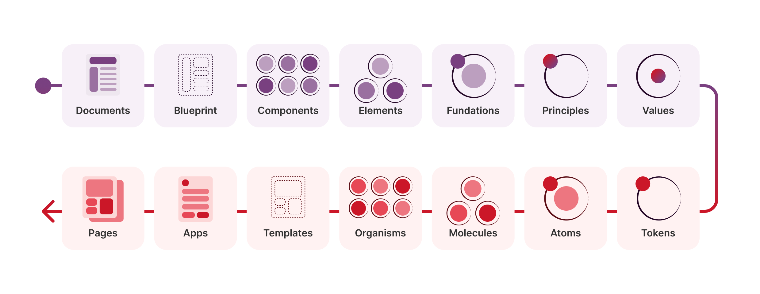
An inverse journey to Atomic Design, built by reverse engineering New World’s digital shopping platforms into a clearer design system microsite.
I chose New World because its website and app showed a common problem in mature digital products. Different design periods were living together. Navigation, type scale, search patterns and component styling were not always consistent across desktop and mobile.
I treated the project as a system reconstruction task. The focus was to understand why the interface felt fragmented, which decisions were repeated without clear rules, and how those decisions could become a more usable design system.
Screencast
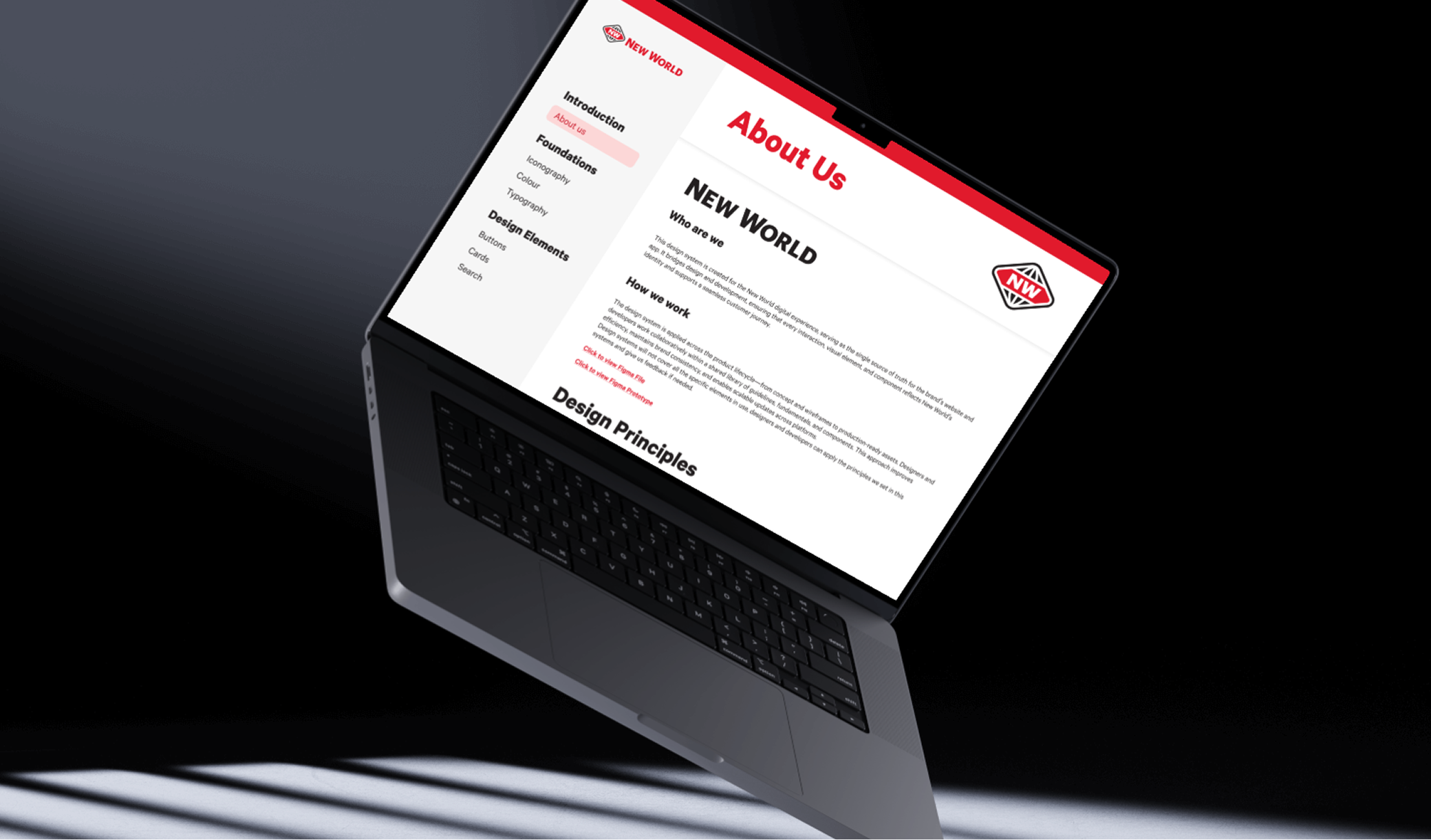
The prototype shows the structure of the Figma microsite, including introduction, foundations and design elements.
Problem
The main problem was not only that some UI elements looked inconsistent. The deeper issue was that New World’s digital platforms lacked shared decision rules.
New and old patterns appeared together, making the design logic harder to follow.
Many similar sizes made hierarchy harder to apply consistently.
Search patterns changed across product and store contexts.
Solution
I used a reverse system approach. Existing interfaces were audited, recurring patterns were identified, and the system was rebuilt into foundations and core design elements.
This approach first moved backwards from complete pages, then moved forward again into reusable foundations, components and documentation.
Outcome
The final outcome was a structured design system microsite in Figma. The value was not only the visual result, but the process of analysing an existing product, abstracting repeated patterns and translating them into clearer design rules.
Course Feedback
“Your UX writing is clear and succinct, making complex ideas easy to understand.”
“The Foundations section is detailed and well-considered.”
“Tackling complex components like cards and search is impressive.”
The process followed four phases. Each phase moved the project from visual evidence toward clearer design decisions.
I audited screenshots and inspected CSS across the website and app.
The findings became stakeholder needs, a problem statement and six principles.
I organised the microsite structure and limited the component scope.
The system became a Figma microsite with foundations and component guidance.
System Audit
I used findings to separate visible inconsistencies from deeper system problems.
Navigation patterns were mixed across website and app screens.
Typography sizes had overlapping roles and unclear hierarchy.
Brand colours were used without a consistent hierarchy.
Search changed across product, store and mobile contexts.
CSS styles showed redundancy and repeated decisions.
Some mobile patterns appeared inherited rather than refined.
Navigation, typography and search patterns did not always share the same rules.
Overlapping styles and unused CSS colours made the system harder to maintain.
Some interface elements moved across platforms without enough refinement for their context.
Principles and Scope
The six principles helped decide what to simplify, what to keep and what needed clearer documentation.
Maintain uniform styles and behaviours across components.
Present information and actions in a straightforward way.
Support people of all abilities and assistive technologies.
Consider diverse user needs, backgrounds and contexts.
Keep interactions minimal without losing functionality.
Make key information and actions easy to notice.
I made a deliberate scope decision. Instead of documenting every possible component, I focused on Search, Cards and Buttons because they carry the core online grocery flow.
Token Ready Foundations
The original assignment did not produce a complete production token library. For this portfolio case study, I describe the work as a token ready foundation, supported by later thinking around primitive, semantic, element and responsive token structures.
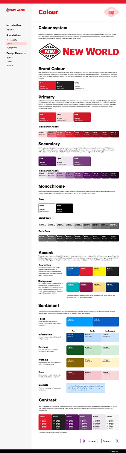
The colour system preserved New World’s primary red and secondary purple. The full colour page is shown above, while this summary extracts the colours most relevant to the system story.
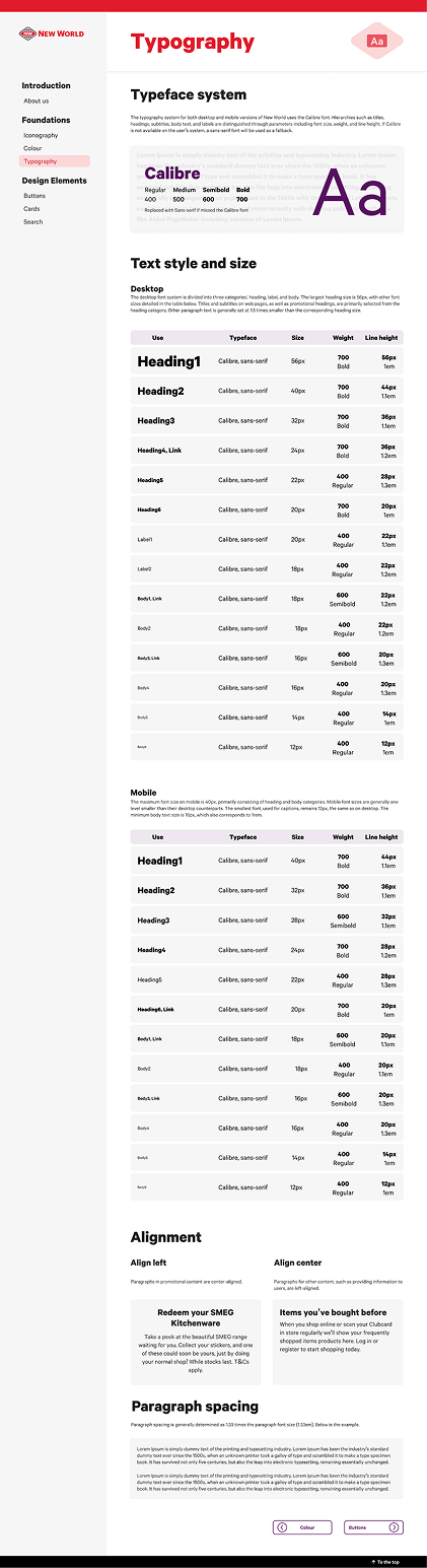
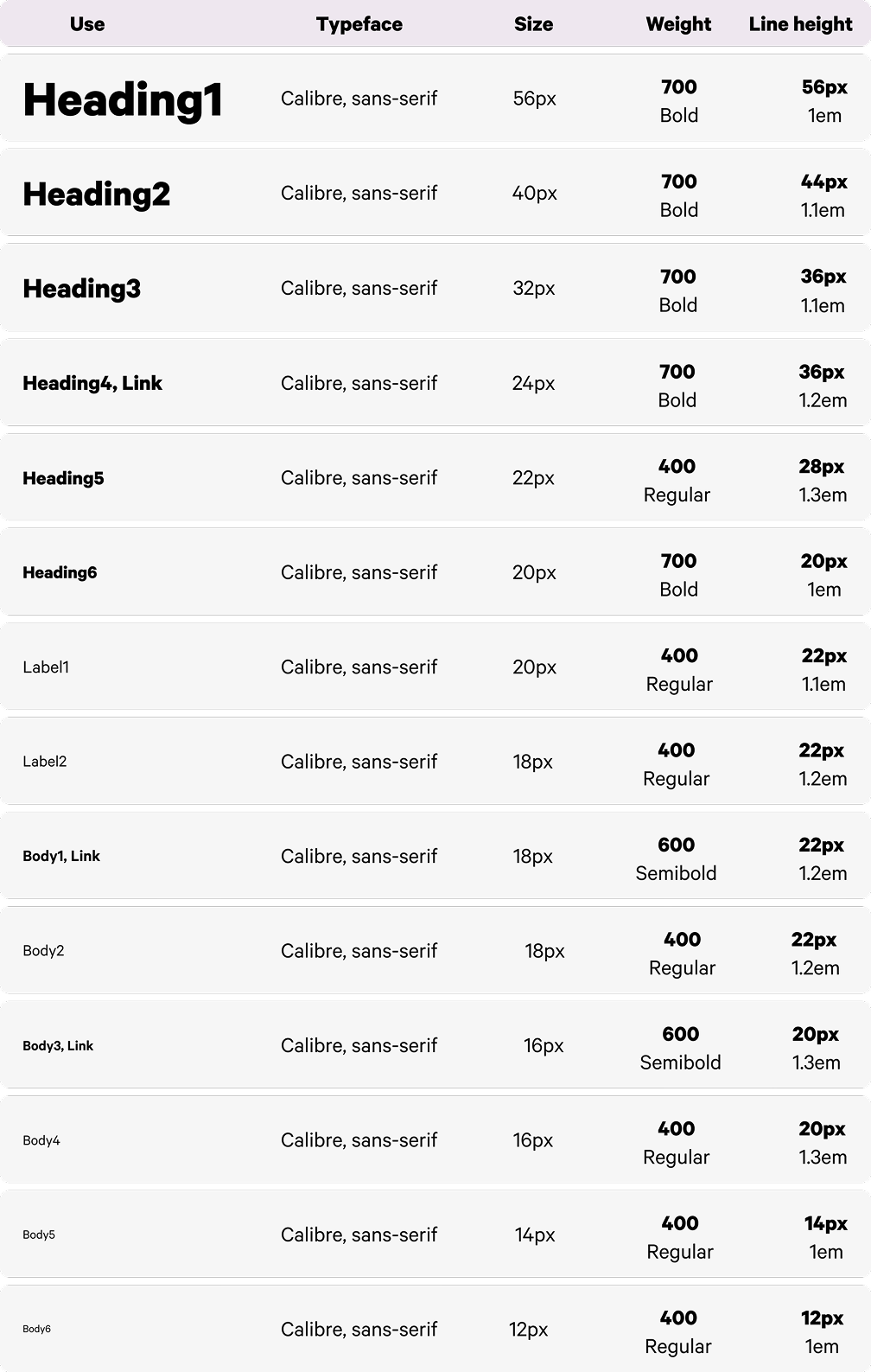
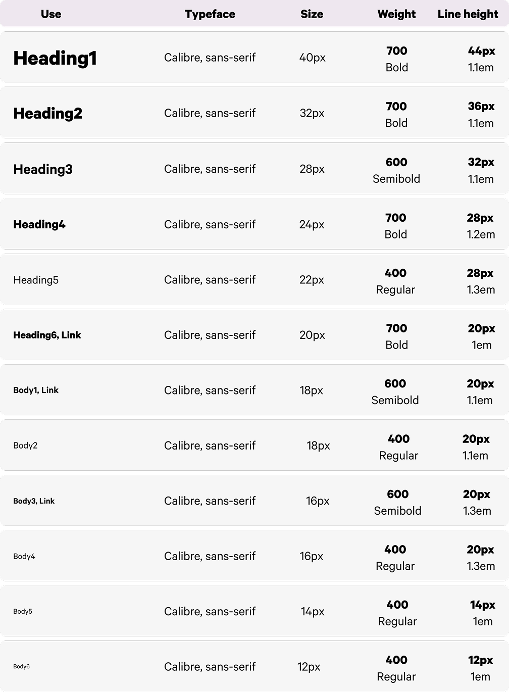
The microsite preview shows the full typography page. The supporting images below focus only on the desktop and mobile scale decisions.
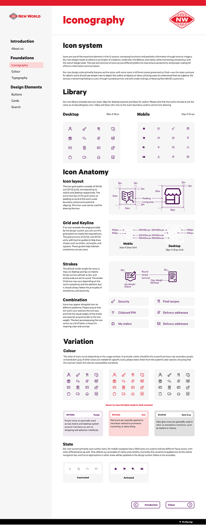
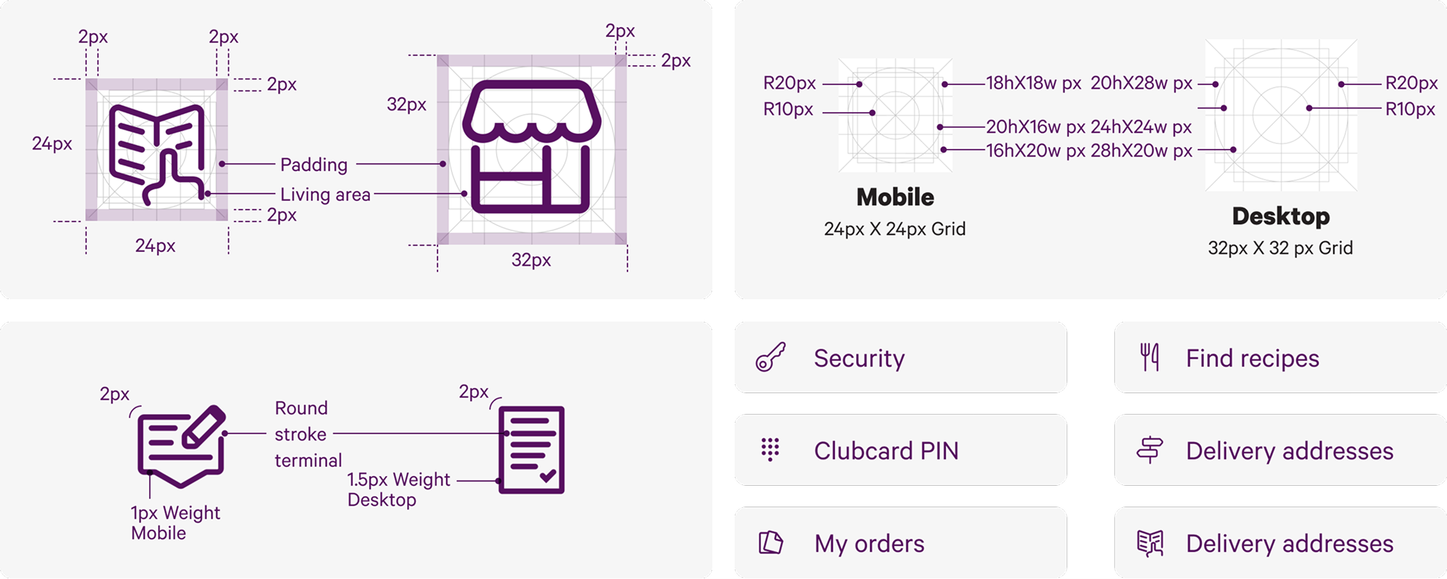
The detail focuses on grid, padding and stroke rules. The full icon library remains visible in the microsite preview above.
Core Components
These components carry the core online grocery journey: finding products, comparing product information and taking action.
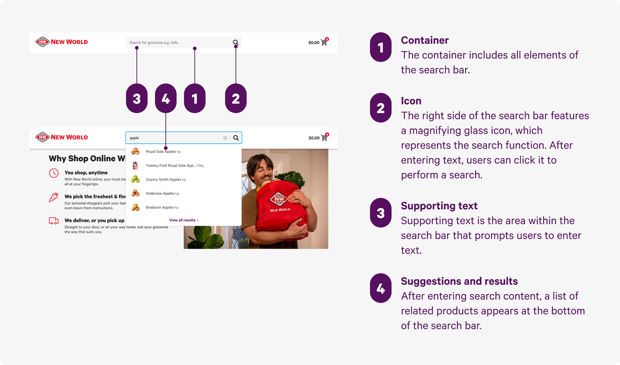
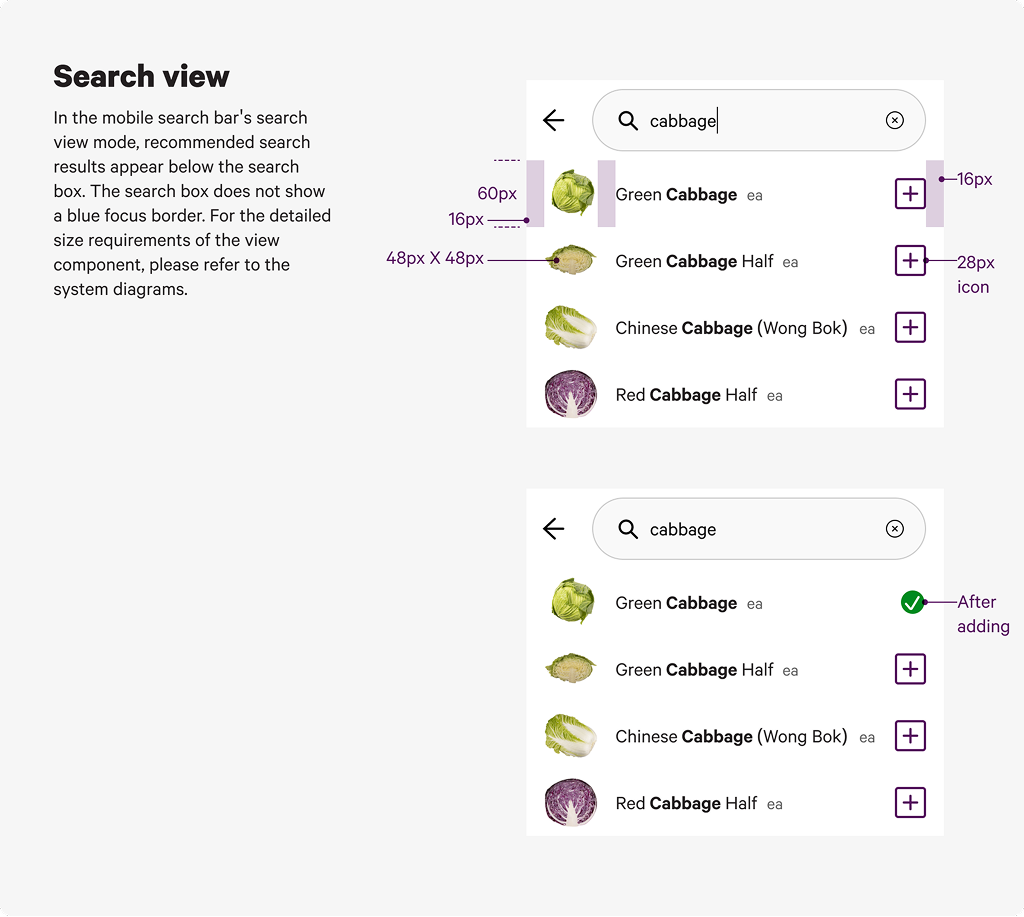
Search System
Search needed to support product discovery, store finding and responsive use cases. The documentation focused on anatomy and result behaviour.
Card System
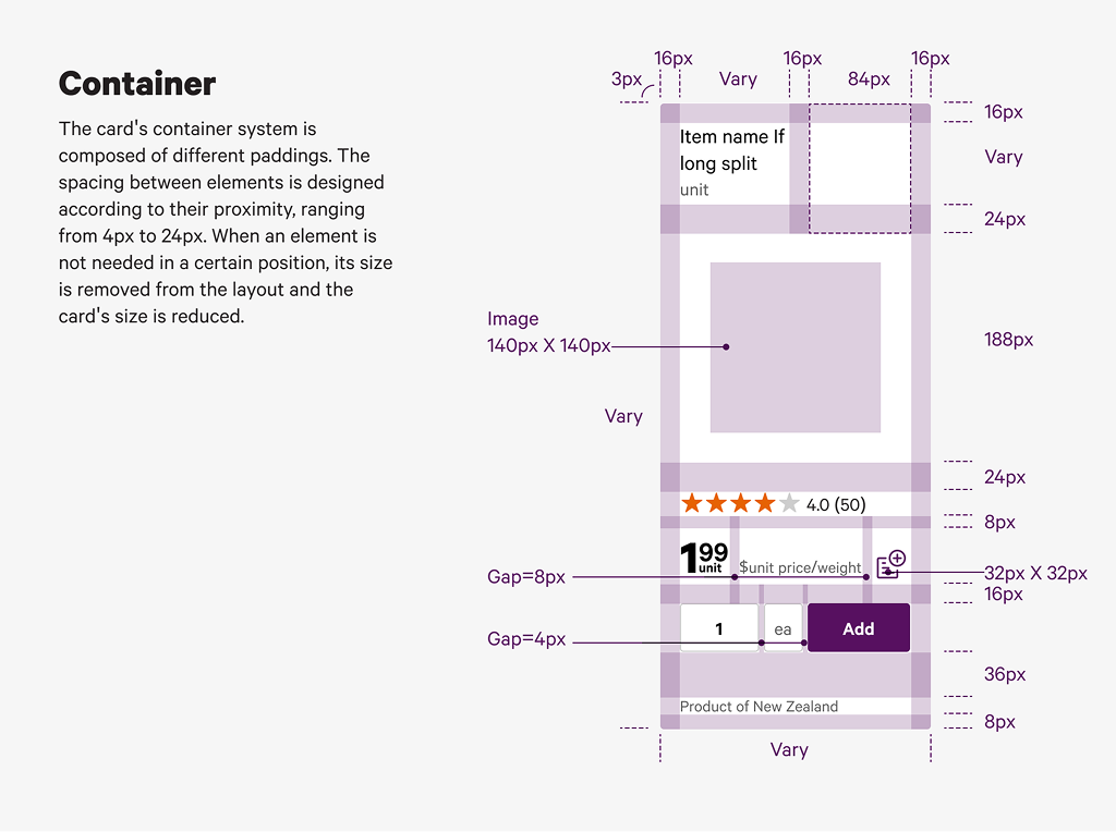
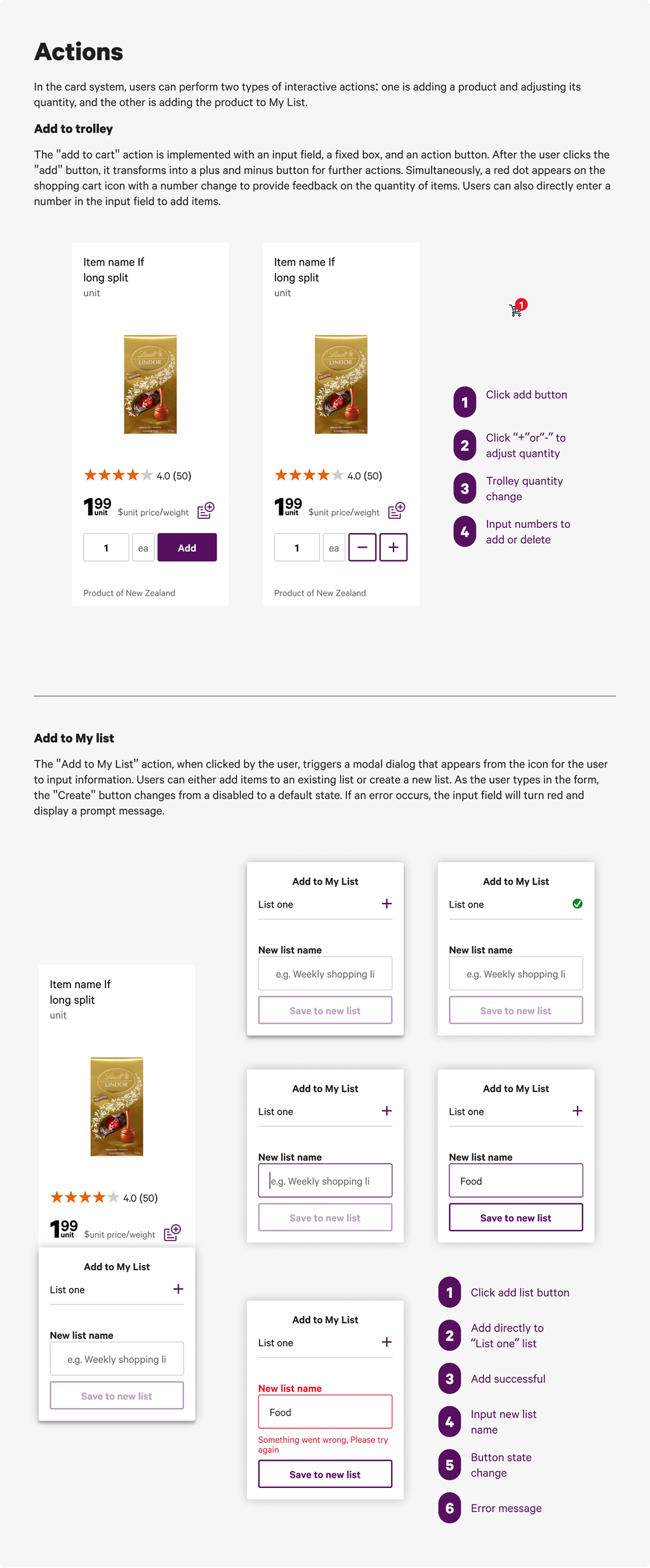
The card system clarified how product image, price, unit detail and actions should work together in a dense grocery interface.
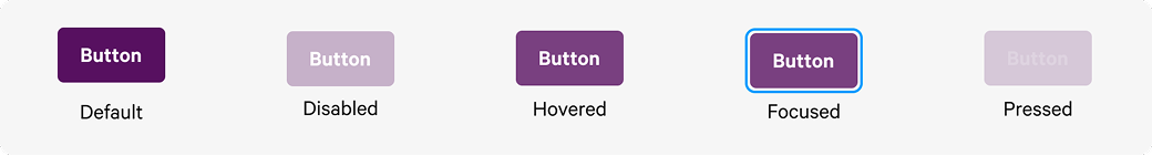
Button System
Button documentation covered hierarchy, variants, states and platform behaviour. The evidence images show how the system defined action emphasis.

Each component page included anatomy, usage guidance, responsive behaviour, interaction states and accessibility considerations. I wanted the microsite to work as a handoff tool, not only a visual presentation.
Figma Variables were an important learning direction. They helped frame how colour, typography and spacing could become more parameterised, although Variables were not fully applied for page control in the original assignment.
Retrospective
This project strengthened my understanding of design systems as living documents and improved my ability to analyse complex interface environments.
The main improvement would be time management. The core documentation needed focus before deeper technical experiments with Variables.
If continued, I would refine the Variables structure, unify remaining visual styles and expand the component library through clearer governance rules.
Primary recipeR17 · Make It Tangible ModelPerception × Meaning × Matter
I used this method to turn interface evidence into tangible assets: colour rules, typography, icon grids, responsive layout, component anatomy and documentation guidelines.
Related Projects
 Service SystemsAccessibility Support HubA support pathway case focused on clearer access to court assistance.
 Service SystemsVictim HubA public sector service improvement case.
 Digital SystemsStudierA dashboard project for research task and response management.
 Spatial SystemsGuangzhou Baiyun T2An architecture case for complex spatial delivery.