Keeping the team and schedule aligned
I set the project schedule, coordinated the team of four, and kept the research, design and delivery phases moving within the five-week timeline.
A mobile platform for sharing, trading and learning upcycling, grounded in — the Māori principle of reciprocal guardianship over people, materials and place.
People want to reduce waste and reuse materials. The intent is consistent. The behaviour rarely follows. Mainstream platforms offer either commerce or inspiration in isolation, and none of them connect practical reuse to the relational ethic that makes the habit durable. ReKraft addresses this gap by combining three linked modules: Community for sharing ideas and outcomes, Market for trading and gifting materials, and for short learning missions rooted in guardianship values.
The project aligns values with (Responsible Consumption and Production). The design argument is that cultural framing is not a visual layer. It is a motivation architecture. When people understand that their actions participate in a living system of care rather than a transaction, the behaviour changes.
Background
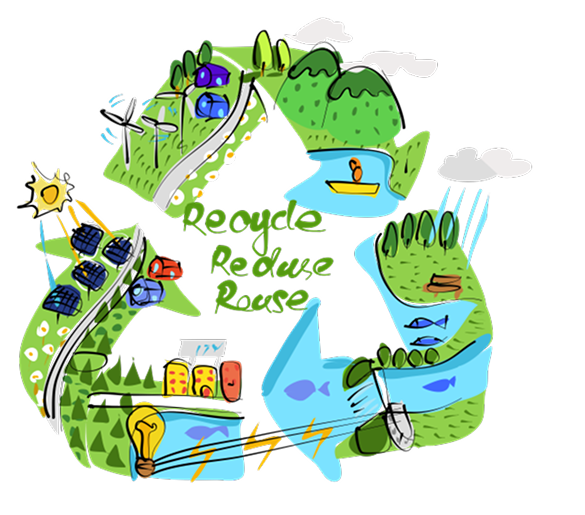
As emerging UX designers, we wanted to respond to global sustainability challenges with empathy and cultural understanding rather than technology alone. Guided by SDG 12, we explored New Zealand's throwaway culture and found that people want to live more sustainably but often lack the time, tools and support. Rooted in Kaitiakitanga — guardianship and care for the sky, land and sea — we used this value as the cultural foundation for everyday sustainable practice.


Problem
Solution
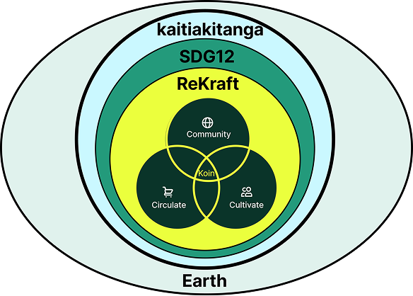
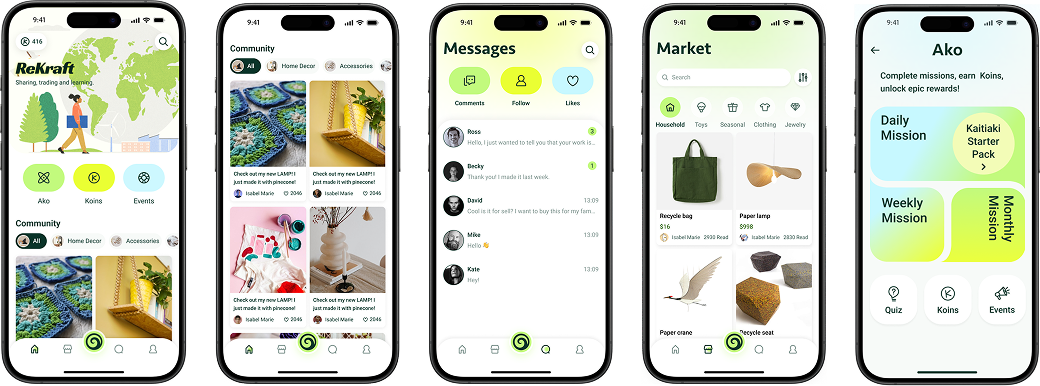
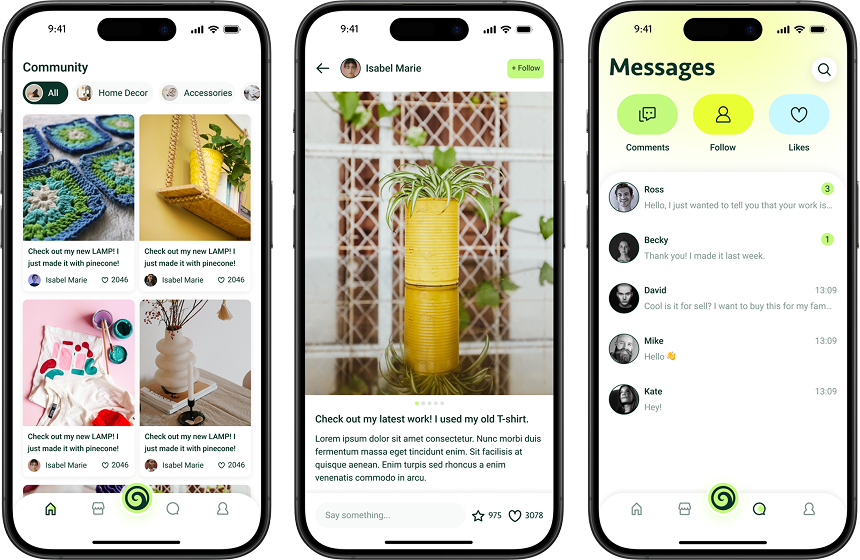
A mobile app grounded in Kaitiakitanga and SDG 12, organised around three linked modules — Community (share DIY practices and inspiration), Marketplace (trade, buy, swap or share items and materials with origin and impact cues and a Koin value mechanism), and Ako (missions and micro-quizzes that teach guardianship principles) — to turn guardianship into concrete micro-actions supported by social motivation and transparent impact.
Outcome
The project delivered a culturally grounded concept and hi-fi prototype showing how people can move fluidly between sharing ideas, obtaining materials, making and repairing, exchanging output, and learning values, while tracking their contributions. The result demonstrates tangible waste reduction behaviours, stronger community participation, and a respectful operationalisation of Kaitiakitanga in contemporary UX.
Feedback
The instructor feedback recognised the project's nuanced, non-tokenistic integration of Kaitiakitanga and the professional-level breadth of research that grounded the concept credibly.
"Nuanced cultural integration — clear, non-tokenistic understanding of Kaitiakitanga, with strong articulation of reciprocal guardianship and its implications for everyday practice."
"Research breadth at a professional level — wide-ranging sources and perspectives that grounded the concept credibly."
Contribution
In this project, I served as Project Manager, UX Designer and Illustrator.
I set the project schedule, coordinated the team of four, and kept the research, design and delivery phases moving within the five-week timeline.
I defined the and , and produced low-to- prototypes and brand and visual assets.
Process
We combined desk and contextual research on Māori values, policies, precedents and markets with co-analysis, then articulated actionable principles and scope. We translated these into information architecture, user flows and iterative prototypes, built around tasks that exercise community sharing, marketplace transactions and learning missions.
Research
Discovery started with a deliberate question: what does Kaitiakitanga demand of a digital product?
Te Ao Māori frames guardianship as reciprocal care, not a one-off act. SDG 12 sets the global policy direction. Neither translates into interaction design without knowing where reuse actually breaks down.
Pinterest, Facebook Marketplace, Depop and repair café networks each solve one dimension. None hold community reciprocity, cultural meaning and practical reuse literacy together.
Practical barriers and motivation gaps reinforce each other. The insights redirected the design toward activation over education.
People want to upcycle but lack the tools, skills and community support to act consistently.
Most people do not see creative reuse potential in everyday waste without a prompt or example.
The origin of materials and the real impact of actions shape whether people participate and return.
No existing platform connects reuse to a relational ethic, which weakens long-term meaning.
Social recognition and shared momentum outperform one-off informational nudges.
Craft and DIY processes often produce offcuts and discards that extend the circularity problem.
Design for the first step, not the informed user.
Surface ideas before asking people to act on them.
Make impact visible, not assumed.
Embed values through interaction, not decoration.
Design for contribution, not just consumption.
Close the loop by including material sharing in the making flow.
This redirected the entire design strategy from education to activation: lower the first step, make community visible, surface provenance and impact, and embed Māori values through action rather than aesthetics.
Design
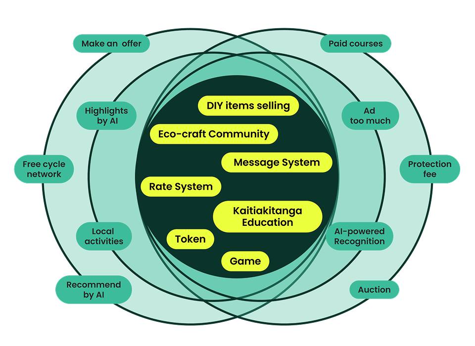
With six findings in hand, ideation surveyed adjacent directions, including a DIY reuse platform, energy sharing and trail-based cultural learning, before converging on a waste-to-treasure community platform for the strongest alignment of SDG 12, feasibility and user appeal. Development then translated the six principles into a three-module product structure, refining flows around publishing, discovery, filtering and missions.
Addresses the isolation barrier from the research: community sustains behaviour better than tips.
Addresses the trust barrier: the origin of materials and the real impact of actions shape whether people participate.
Addresses the values barrier: cultural values are absent from mainstream reuse tools.
Each module addresses a different barrier from the research without duplicating what the others do, which kept the MVP scope from turning into three copies of the same feature.
Develop
The concept diagram anchors everything that follows: three linked modules inside a Kaitiakitanga and SDG 12 frame, with Koin as the connecting mechanism.
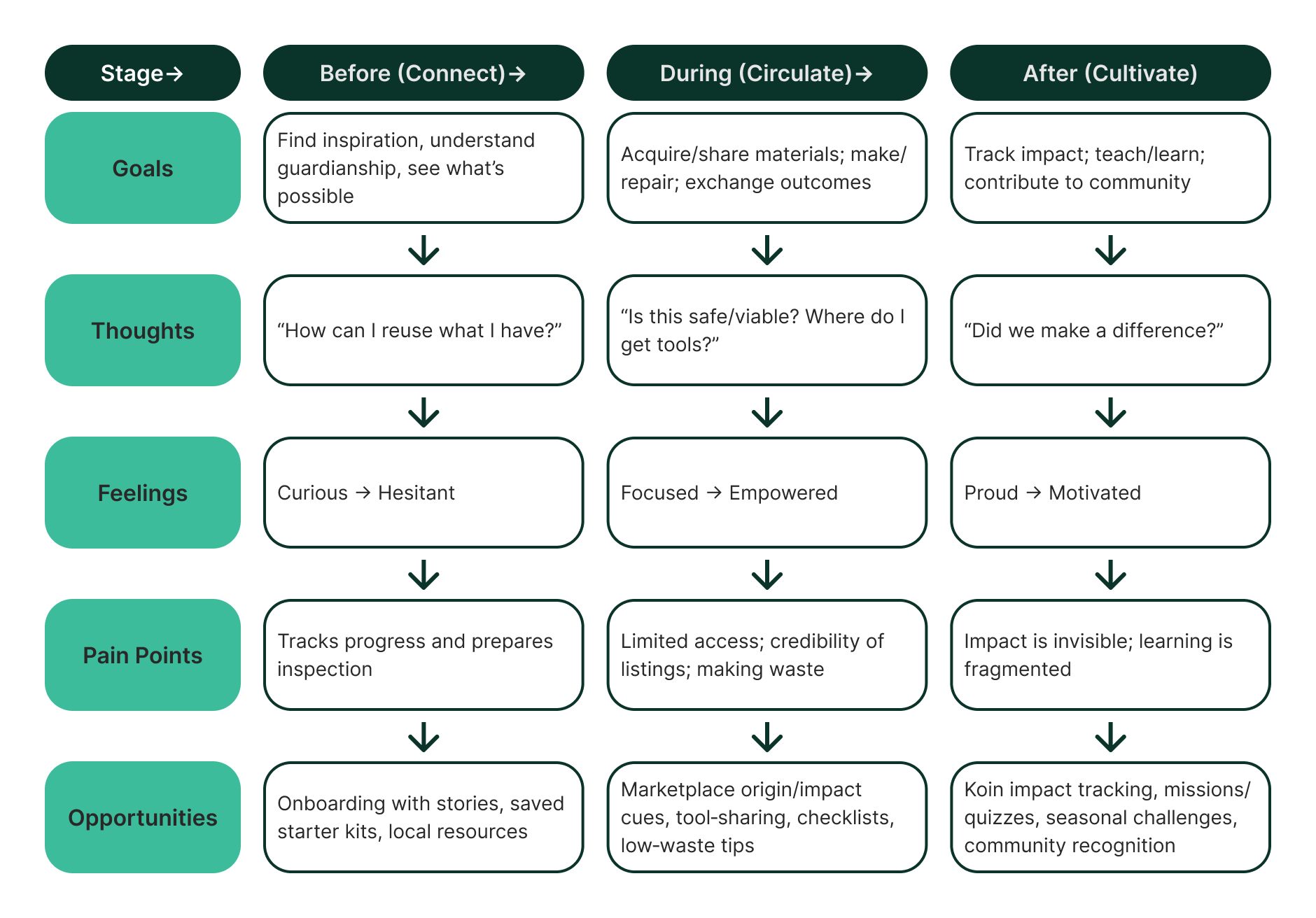
Prototyping moved from paper sketches to lo-fi flows to mid-fidelity screens. Each stage had a specific job. Sketches explored navigation and entry points. Lo-fi flows established content hierarchy and explored whether the three modules felt distinct but connected.
Exploring whether the three modules felt distinct but connected directly shaped the final IA, giving Community, Market and Ako shared navigation but separate content rhythms.
Design System
The design system was not built after the content. It was developed alongside it, because the visual language needed to express Kaitiakitanga rather than decorate it. Every colour, type and illustration decision was tested against the question: does this feel like guardianship, or does it feel like greenwashing?
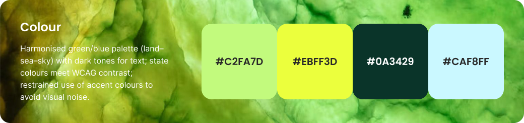
The palette centres on forest and teal greens drawn from natural ecosystems rather than brand conventions. The dark green grounds the interface with stability, the mid teal carries interactive and action states, and secondary tones support hierarchy without competing for attention.
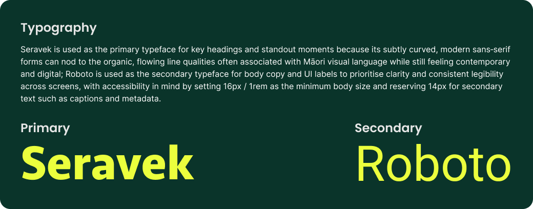
Seravek carries headlines with a rounded, approachable quality that suits community content, while Roboto handles body text and interface labels at smaller sizes. The pairing avoids the coldness of purely technical typefaces while maintaining clear reading hierarchy across a dense information environment.
Illustrations use a loose, crafted style that references the act of making by hand, a deliberate choice against polished stock imagery, which would undermine the platform's claim that reuse is accessible.
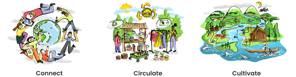
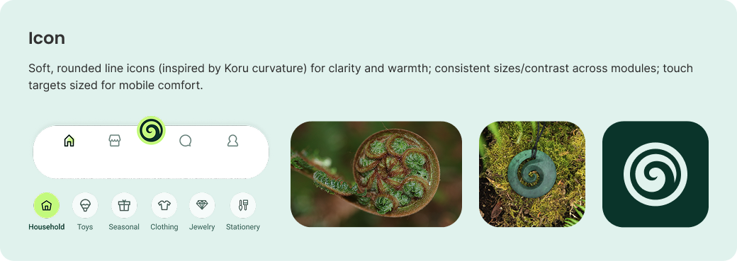
Icons follow a consistent weight system for navigational and action states, keeping recognisability and legibility across small touch targets on mobile.
The ReKraft wordmark pairs with a circular mark that references both the recycling loop and the koru, a Māori symbol of growth and new beginnings. The identity needed to work across a mobile interface and physical touchpoints without losing legibility or cultural resonance at small sizes.
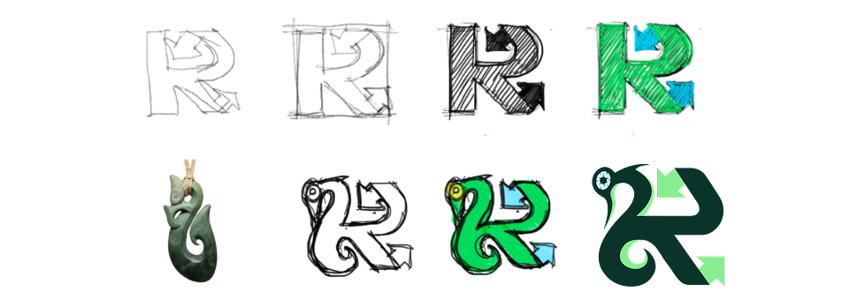
This question filtered every visual decision that followed — pushing the palette toward natural greens, the illustrations toward hand-drawn warmth, and the brand mark toward symbolism rather than decoration.
Test plan
I wrote a usability test plan for the ReKraft prototype. It was designed to measure three things: whether people could complete a core task in each module, where navigation and content discovery might break down, and whether Kaitiakitanga and SDG 12 came through clearly in the design rather than staying implicit.
Given an old wooden chair to sell, participants would use ReKraft to publish the relevant product information.
Given unused glass jars, participants would use ReKraft to find relevant information on what to do with them.
Participants would locate and complete a short quiz about Kaitiakitanga inside the Ako module.
Pre- and post-test questions were planned to check participants' prior engagement with sustainability topics and, afterward, whether the social features helped them find what they needed, whether the learning module met expectations, and where the app still felt confusing.
Delivery
The three modules were not designed as features. They were designed as answers to specific research findings. The community feed answers the isolation problem. The market answers the access and trust problem. Ako answers the skills and meaning problem. Together they form a loop rather than a list.
Onboarding
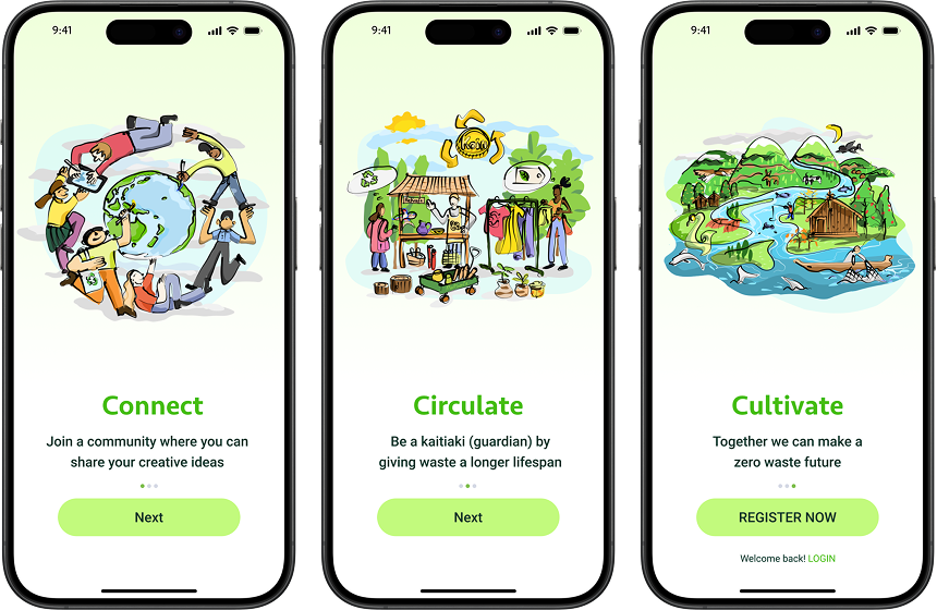
The onboarding flow was one of the last things designed and one of the most considered. The decision to lead with a Kaitiakitanga story rather than a feature tour was deliberate. Users who understand the platform's purpose before they see its features are more likely to form the right mental model for what the community asks of them. The first experience sets the relational contract.
Market
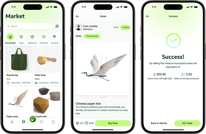
The Market module applies a key insight from the trust finding: people are more likely to engage with a listing when they understand where the material came from and what giving it away or buying it means in circularity terms. Every listing includes provenance and impact fields. This is not optional metadata. It is the mechanism that turns commerce into a values-aligned exchange.
Community
The Community module centres on DIY sharing and peer recognition. The design decision was to prioritise posts that show the before state — the raw material — alongside the outcome. This reduces the intimidation of a polished result and makes the making process itself the contribution. Users see that the gap between waste and creation is smaller than they assumed.
Ako
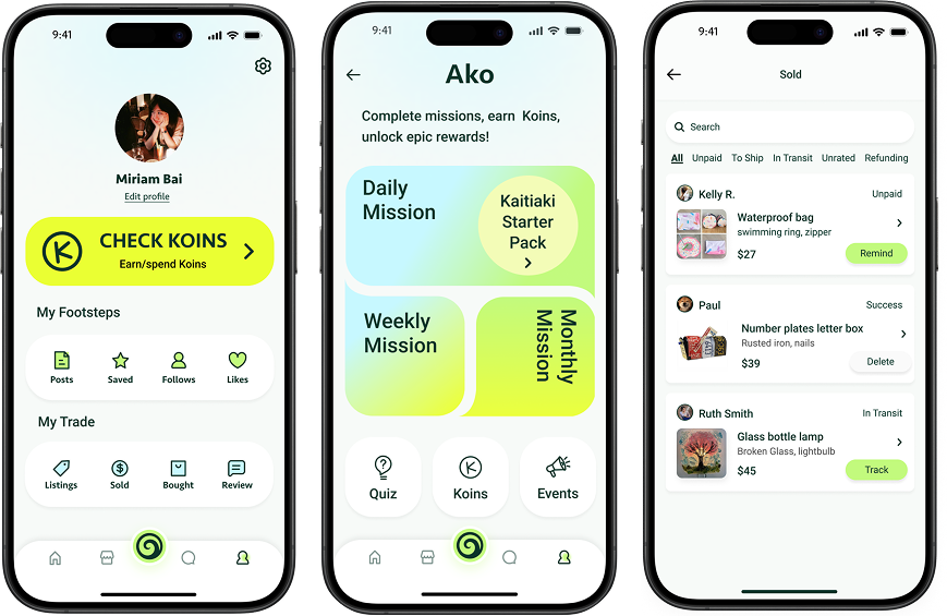
Ako is the learning module, but it was not designed as an education product. It was designed as a habit formation system. Missions are short, action-first and tied to the Koin recognition system. Completing a mission earns visible community standing, which connects personal learning to the relational value that Kaitiakitanga describes. The module closes the loop between knowing and doing.
Reflection
The project demonstrated that cultural framing can function as a motivation architecture rather than a visual add-on. The three-module structure worked as one loop rather than three separate features.
The concept has not been tested with enough participants for a culturally situated product. Māori community input was referenced in the literature review but not embedded in the co-design process. That gap needs closing before any real deployment.
A community pilot, genuine co-design with Māori knowledge holders, and longitudinal behaviour tracking to test whether the Koin system actually sustains circular habits rather than rewarding one-off engagement.
Primary recipe R07 · Purpose Story Script
This project uses R07 because the core design challenge was not functional. It was motivational. ReKraft needed to help people understand who they are in relation to materials, community and the environment before it asked them to do anything. The onboarding, the Ako missions and the provenance fields in the Market all express the same recipe: anchor identity, then invite action.
Secondary recipe
Related Projects
 Digital Systems
New World Design System
A design system case focused on reusable UI structure at scale.
Digital Systems
New World Design System
A design system case focused on reusable UI structure at scale.
 Community
Voting Starter Kit
A multi-channel starter kit helping new immigrants engage with local elections.
Community
Voting Starter Kit
A multi-channel starter kit helping new immigrants engage with local elections.
 Service Systems
Accessibility Support Hub
A support pathway case focused on clearer access to court assistance.
Service Systems
Accessibility Support Hub
A support pathway case focused on clearer access to court assistance.
 Digital Systems
Who's Singing OuTūīside?
A public communication case using data, ecology and visual storytelling.
Digital Systems
Who's Singing OuTūīside?
A public communication case using data, ecology and visual storytelling.